Introduction
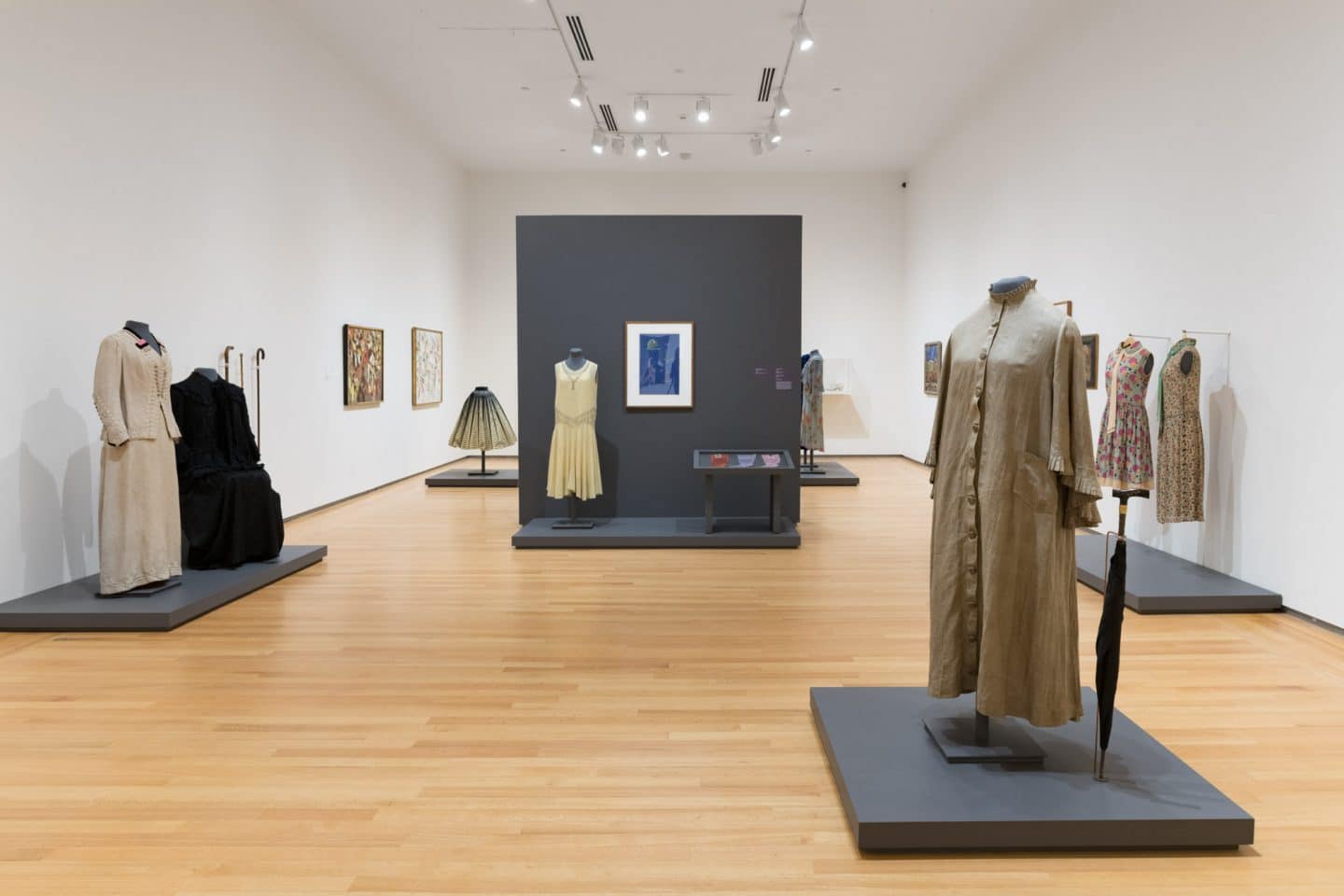
Gallery going emerged as a public pleasure in Canada in the late nineteenth century, with the establishment of its first art museums, in either purpose-built or repurposed spaces. Today, this cultural activity happens everywhere across the country, and the task of dressing for it goes hand-in-hand. What to wear to an art gallery? The exhibition Stepping Out: Clothes for a Gallery Goer draws from the Queen’s University Collection of Canadian Dress to propose garments that one might have worn, perhaps to an opening, at a children’s event, for a study session or on a Sunday afternoon. Decade by decade, spanning the 1860s to 1970s, these outfits and accessories are paired with contemporaneous works of art. As gallery goers we perform identities through the clothes we wear, as much on-display as the displays themselves. Fittingly, the Collection of Canadian Dress had its auspicious beginnings as costume wardrobe, performed pieces, for university theatre productions. The collection’s astute overseer and later first curator, Margaret Angus, recognized the regional significance and museum quality of select pieces donated from the Kingston community, and separated them out to form a dress collection, which eventually fell under the auspices of the Agnes Etherington Art Centre.

Left to right: Unknown Maker, resoled by Robert Green, Boots, around 1900, leather. Gift of Paul Fritz, Arts ’61, 2013 (C13-003.03a-b). Worn by Lura Vivian Green Fritz; Best and Co., New York, Boots, early twentieth century, canvas, glass and leather. Gift of Mary Book, 1973 (C73-626.31); Unknown Maker, Boots, around 1910, leather and cotton. Gift of Jean McBratney, 1982 (C82-649.5). Photo: Paul Litherland

Left to right: Unknown Maker, resoled by Robert Green, Boots, around 1900, leather. Gift of Paul Fritz, Arts ’61, 2013 (C13-003.03a-b). Worn by Lura Vivian Green Fritz; Best and Co., New York, Boots, early twentieth century, canvas, glass and leather. Gift of Mary Book, 1973 (C73-626.31); Unknown Maker, Boots, around 1910, leather and cotton. Gift of Jean McBratney, 1982 (C82-649.5). Photo: Paul Litherland
What does it mean for an art gallery to have a clothing collection? It recognizes that fashion is art, or concedes that art is fashion. In Stepping Out, the pairing of artworks and historical dress reveals shared and changing aesthetics, deliberate and subliminal influences that go both ways between the so-called (or previously known as) “high” and “decorative” arts. Clothing and artworks intermingle as visual media. Some objects have intriguing local stories, while others continue to hide them. Talented unknown dressmakers are presented alongside renowned Canadian and international designers. This digital publication walks through the exhibition, touching upon highlights, with feature texts by curators, historians and dress specialists, all of whom have previously worked with the collection.
AB
……..

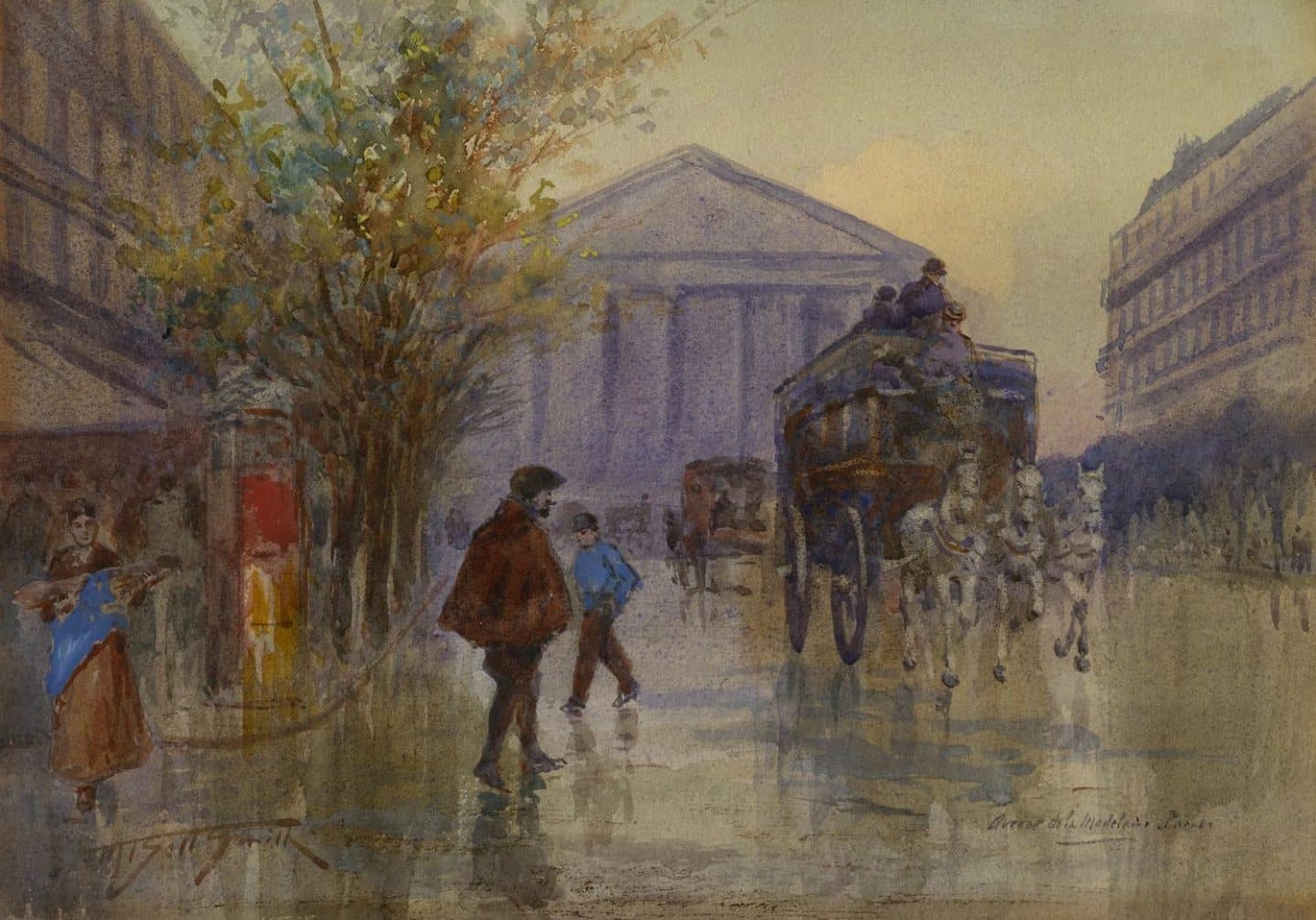
Frederic Marlett Bell-Smith, Avenue de la Madeleine, Paris, around 1896–1916, watercolour on paper. Transfer from Ban Righ, 1975 (00-323). Photo: Agnes Etherington Art Centre

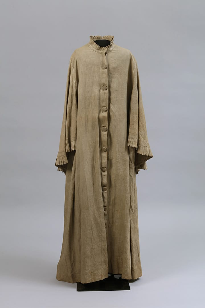
Unknown Maker, Duster Jacket, 1880s–1890s, linen. Gift of Jessie Orr, 1964 (C64-569.47). Photo: Bernard Clark

Frederic Marlett Bell-Smith, Avenue de la Madeleine, Paris, around 1896–1916, watercolour on paper. Transfer from Ban Righ, 1975 (00-323). Photo: Agnes Etherington Art Centre

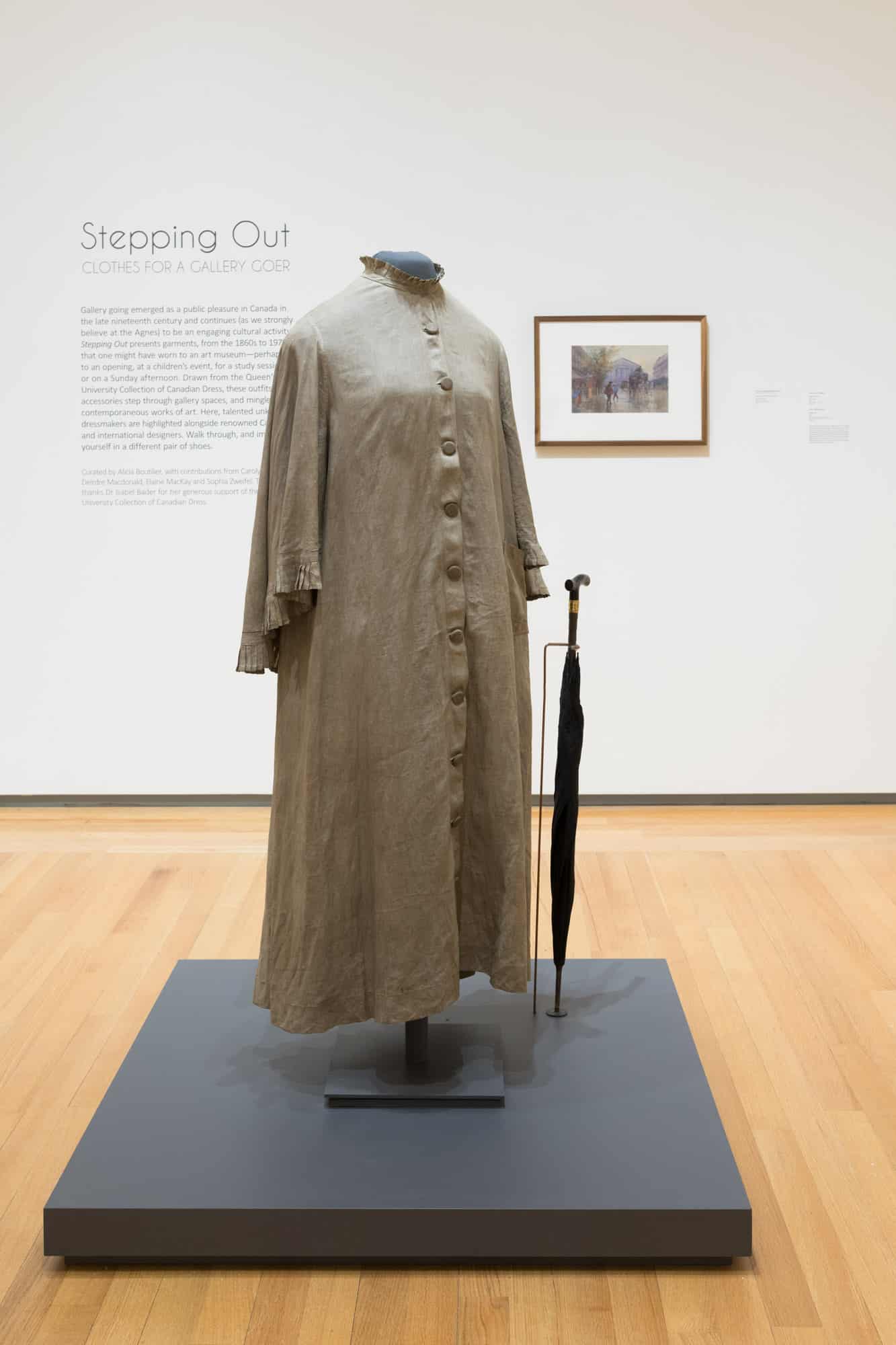
Stepping Out: Clothes for a Gallery Goer, installation view, 2019. Photo: Paul Litherland

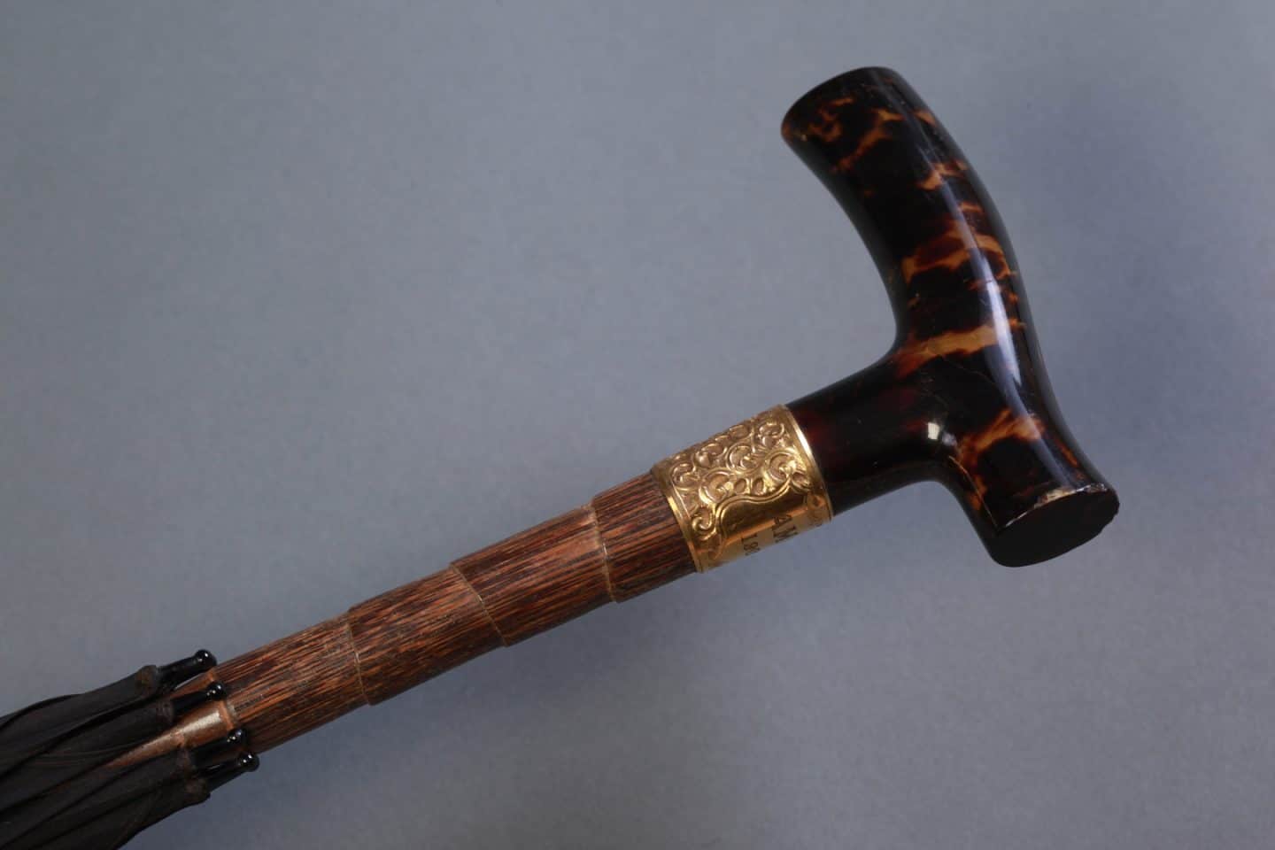
Samuel Fox and Co., Umbrella (detail), 1902, silk, wood, metal and tortoiseshell. Gift of the estate of Wilhelmina Gordon, 1968 (C68-590.4). Photo: Bernard Clark
Duster Jacket: 1880s–1890s
Dirt was inevitable when it came to outdoor clothes, and presented itself in many different forms in the late nineteenth century. Industrial smog filled the air, carriage wheels kicked up dust and splatter, and steam engine smoke passed through passenger car windows. When venturing outdoors, women needed to protect the delicate fabrics of their latest fashions from dirt’s persistent manifestations. Many of the luxury fabrics and furs used in upper- and upper-middle-class clothing were not washable, and had to be protected when outdoors by overlaying them with simpler, hardier garments. The duster—a thin, loose-fitting style of jacket—became popular among women for this very purpose, and was worn as a practical outer layer while travelling. 1
This example of a duster jacket, likely from the late nineteenth century, is made entirely of linen. Its simple cut provides the wearer with full coverage: it has a full-length skirt and pagoda-like sleeves that create a cape effect around its back. A row of large, linen-covered wood buttons fasten the full length of the jacket’s centre front. The elegant simplicity of the jacket is elevated by a trim of crisp pleating that runs along its collar and the long edge of its caped sleeves. The jacket was likely custom-made by a local dressmaker (fig. 1). Its seams are all machine-stitched with a chain stitch characteristic of early sewing machines. The elements of the jacket’s construction come together to fulfil its function as a practical, but elegant, shield against dust and dirt.
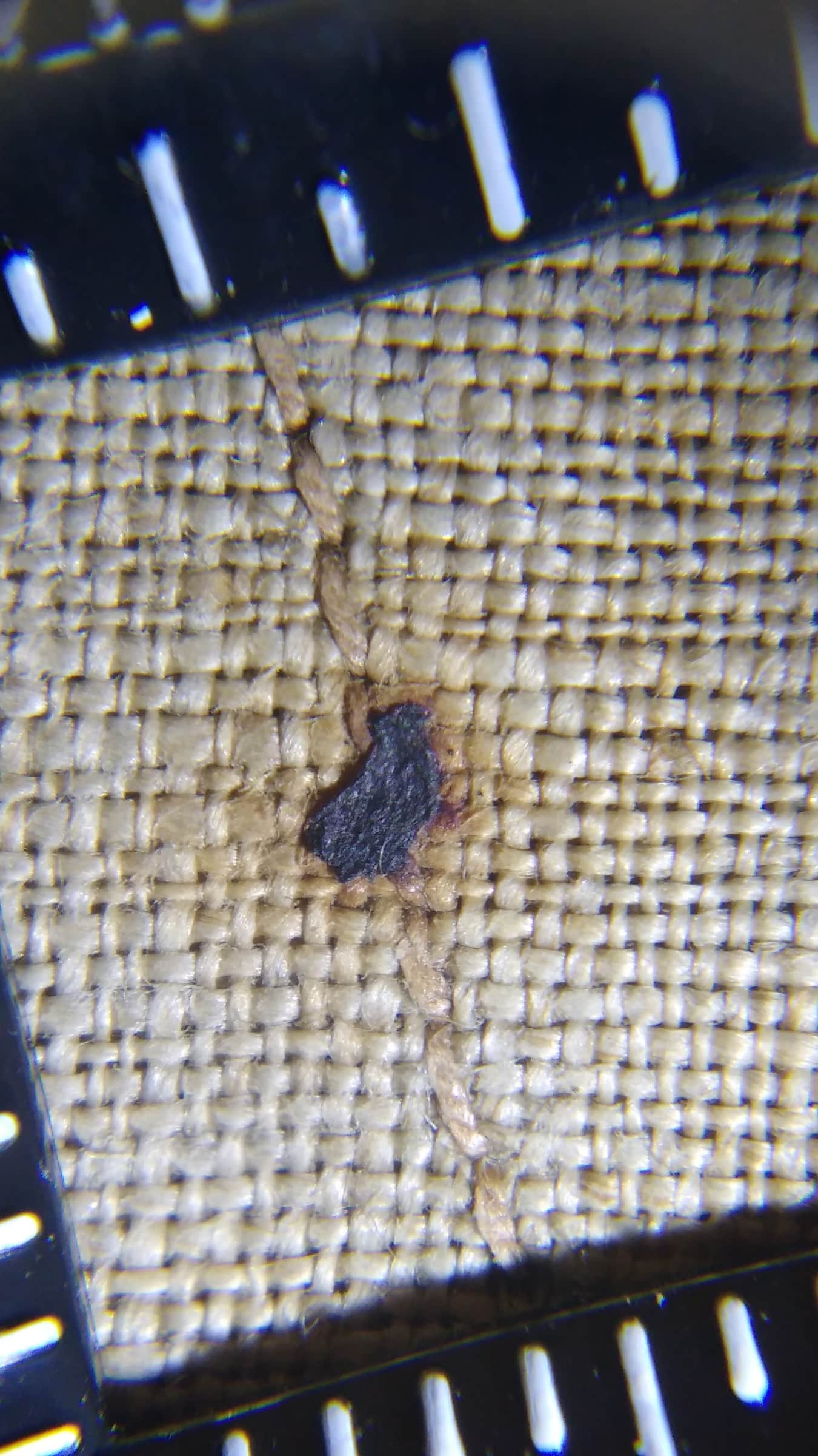
A probing look at this jacket, however, reveals more about the elements from which it was intended to protect its wearer. Under low magnification, full particles of iron can be seen on the surface of the linen’s fibres (fig. 2), and faint corrosion stains throughout the garment suggest the presence of even smaller iron contaminates. These traces paint a vivid picture of the industrial air that engulfed the wearer as she went about in urban spaces. Furthermore, the lustrous finish on the linen’s surface, when viewed under UV light, is disturbed by water spots, as if the jacket’s wearer got caught in the rain. What is this finish, and did it serve a purpose?

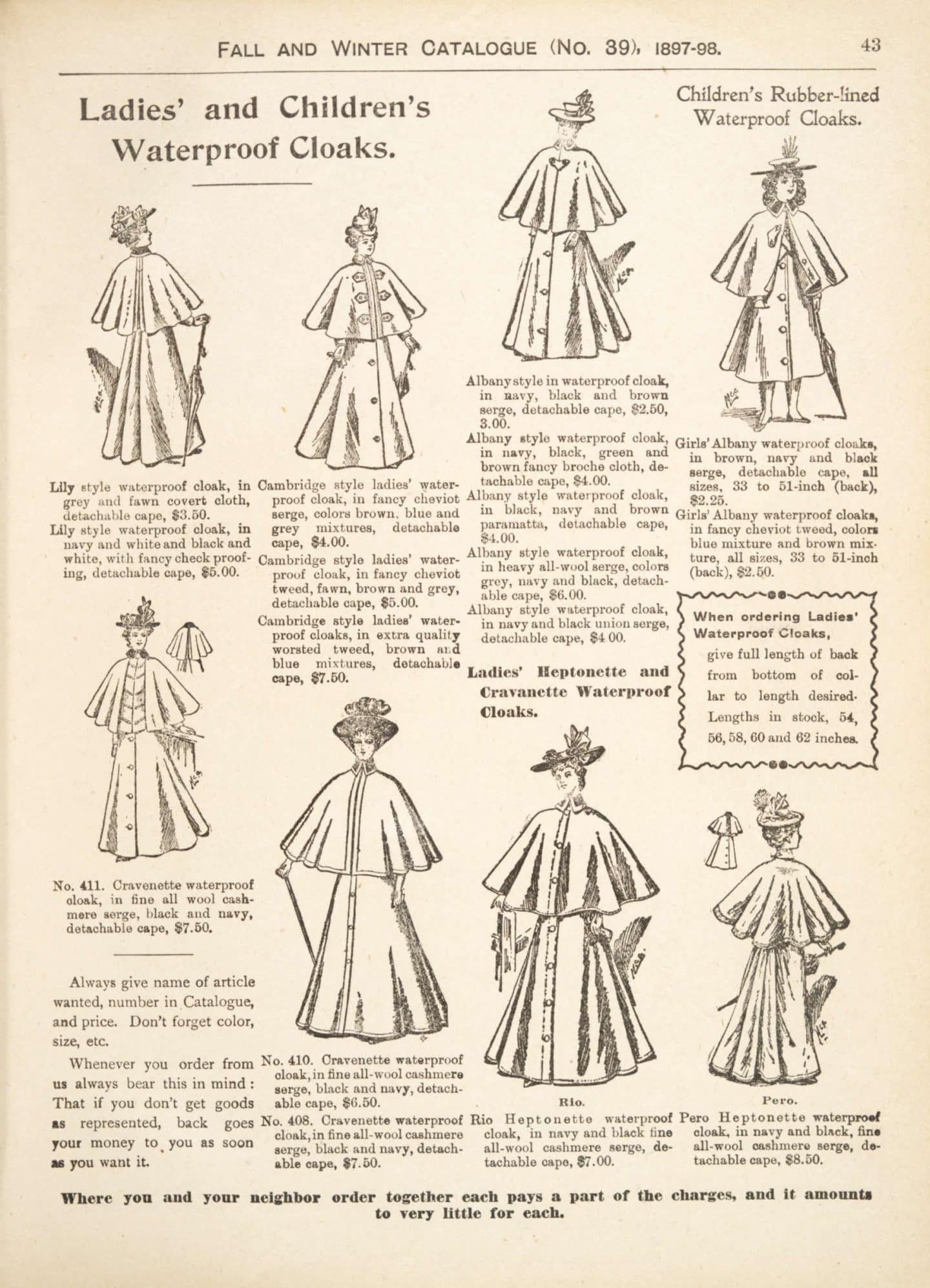
FIG. 1 It is possible that our handmade duster jacket imitated styles for sale in department store catalogues. A similar style of waterproof cloak, as seen here in Eaton’s 1897–1898 fall and winter catalogue, was fashionable in Canada toward the end of the nineteenth century.

FIG. 1 It is possible that our handmade duster jacket imitated styles for sale in department store catalogues. A similar style of waterproof cloak, as seen here in Eaton’s 1897–1898 fall and winter catalogue, was fashionable in Canada toward the end of the nineteenth century.

FIG. 2 Magnified view of an iron particle found toward the bottom hem of the linen duster jacket. Traces such as this offer clues about the environment in which the jacket was worn. Increments on the edge are in millimeters.
The finish on this jacket was investigated as part of the 2017 Isabel Bader Fellowship in Textile Conservation and Research. Linen fibres were examined by a series of analytical methods in an effort to identify the composition of the finish so as to better characterize its function. The analysis found that not only common starch, but also beeswax and tallow wax were present within the finish on the outside of the jacket—a mixture that suggests the finish was likely intended as a waterproofing agent. 2 In examining a carefully hand-stitched mend made toward the bottom of the jacket, the finish can be seen on top of the repair stitching, indicating that it was applied after the repair. This subtle detail reveals that the finish was applied as part of the jacket’s regular maintenance. After each washing, the waxes were likely rubbed on and pressed with a hot iron by a diligent housekeeper, readying the jacket for its wearer to go out in the rain, and possibly to an art museum. 3
SZ
……..

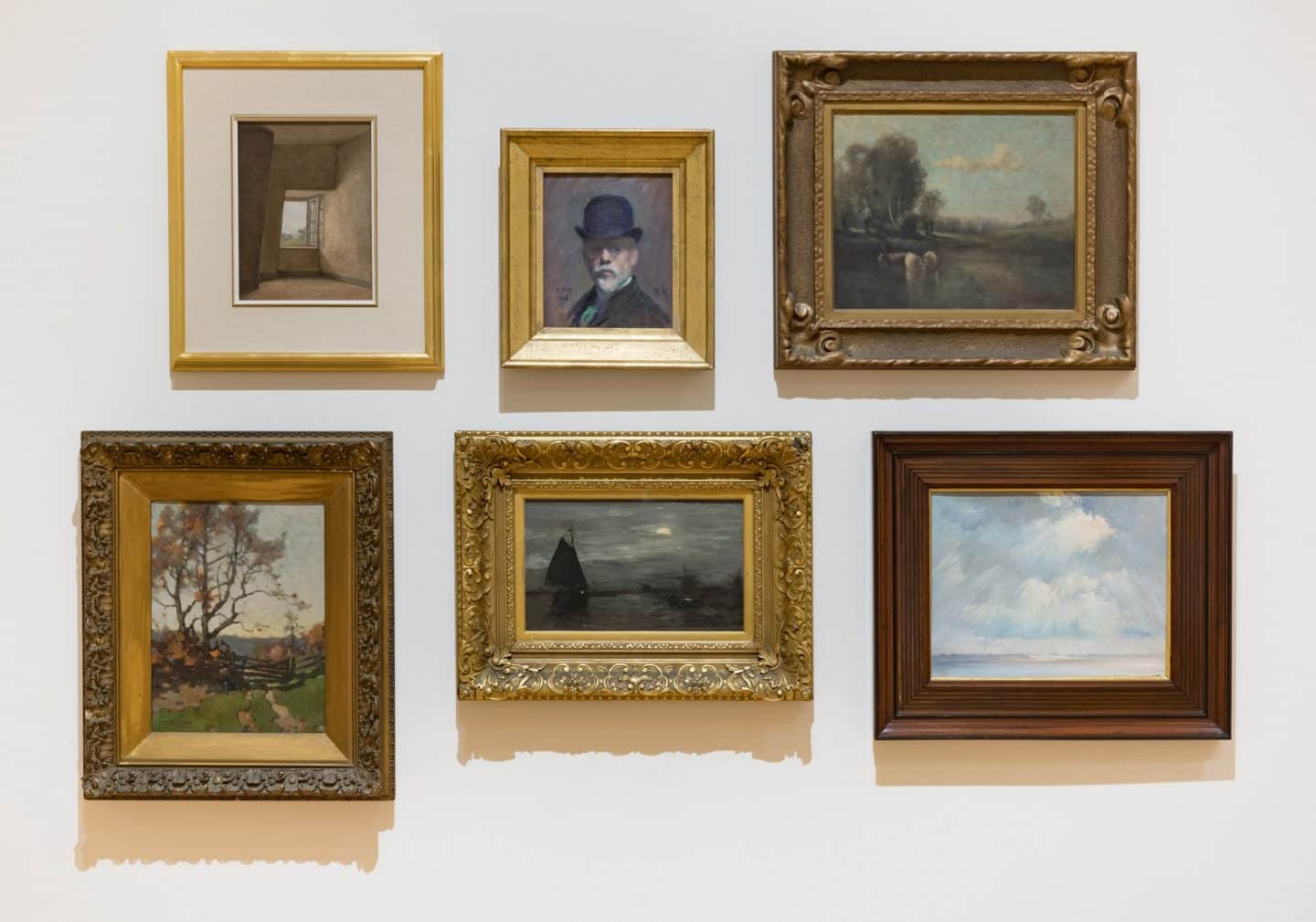
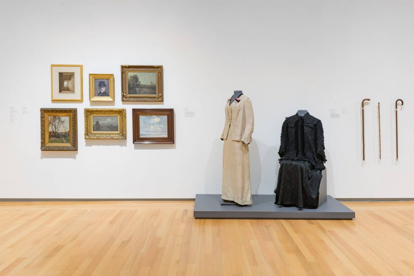
Top: Ozias Leduc, Open Window, around 1900, oil on cardboard. Purchase, Chancellor Richardson Memorial Fund, 1997 (40-025); Robert Harris, Self-Portrait, 1908, oil on cardboard. Purchase, George Taylor Richardson Memorial Fund, 1969 (12-001); John Hammond, Landscape with Cows, 1909, oil on canvas. Gift of Dr Thomas Gibson 1942 (00-313); Bottom: Jan Hendrik Weissenbruch, Seascape, 1901, oil on panel. Gift in memory of Professor Alastair Walker by Robert, Jennifer and Elizabeth, 1992 (35-034); John William Beatty, Landscape, 1904, oil on canvas. Gift of Robert and Yvonne Inkster, 2011 (54-003); Percyval Tudor-Hart, Sun Rays through Stormy Sky, Côtes-du-Nord, 1904, oil on canvas. Gift of the Estate of C. Tudor Hart, 1974 (17-023). Photo: Paul Litherland

Stepping Out: Clothes for a Gallery Goer, installation view, 2019. Photo: Paul Litherland

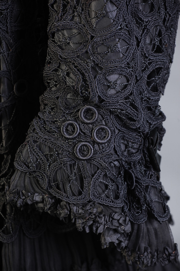
Duncan Smith, London, Jacket (detail), 1903–1904, silk and lace. Gift of the estate of Wilhelmina Gordon, 1968 (C68-590.16). Worn by Eliza Gordon. Photo: Bernard Clark

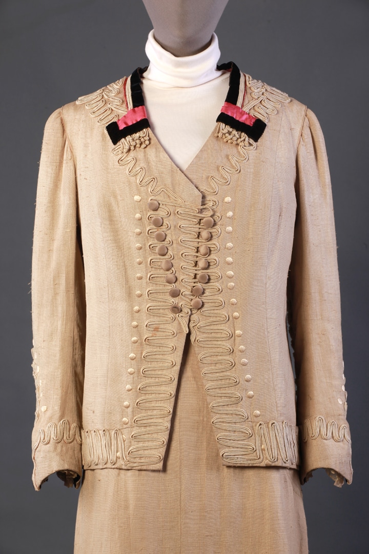
Unknown Maker, Dress Suit (detail), 1905–1909, silk, linen, cording and lace. Gift of Mrs. W. R. P. Bridger, 1962 (C62-552.3a-d). Worn by Minnet Bridger. Photo: Bernard Clark

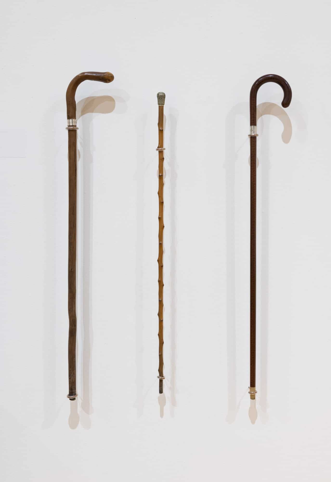
Unknown Makers, Canes, 1914, wood and silver; undated, wood, silver and bone; undated, wood and silver. Gift of the estate of Wilhelmina Gordon, 1968 (C68-590.1, C68-590.2, C68-590.3). Photo: Paul Litherland

Top: Ozias Leduc, Open Window, around 1900, oil on cardboard. Purchase, Chancellor Richardson Memorial Fund, 1997 (40-025); Robert Harris, Self-Portrait, 1908, oil on cardboard. Purchase, George Taylor Richardson Memorial Fund, 1969 (12-001); John Hammond, Landscape with Cows, 1909, oil on canvas. Gift of Dr Thomas Gibson 1942 (00-313); Bottom: Jan Hendrik Weissenbruch, Seascape, 1901, oil on panel. Gift in memory of Professor Alastair Walker by Robert, Jennifer and Elizabeth, 1992 (35-034); John William Beatty, Landscape, 1904, oil on canvas. Gift of Robert and Yvonne Inkster, 2011 (54-003); Percyval Tudor-Hart, Sun Rays through Stormy Sky, Côtes-du-Nord, 1904, oil on canvas. Gift of the Estate of C. Tudor Hart, 1974 (17-023). Photo: Paul Litherland
Jacket and Dress Suit: 1900s–1910s
These two outfits are very different in terms of colour and period styling, despite being fashionable within a few years of each other.
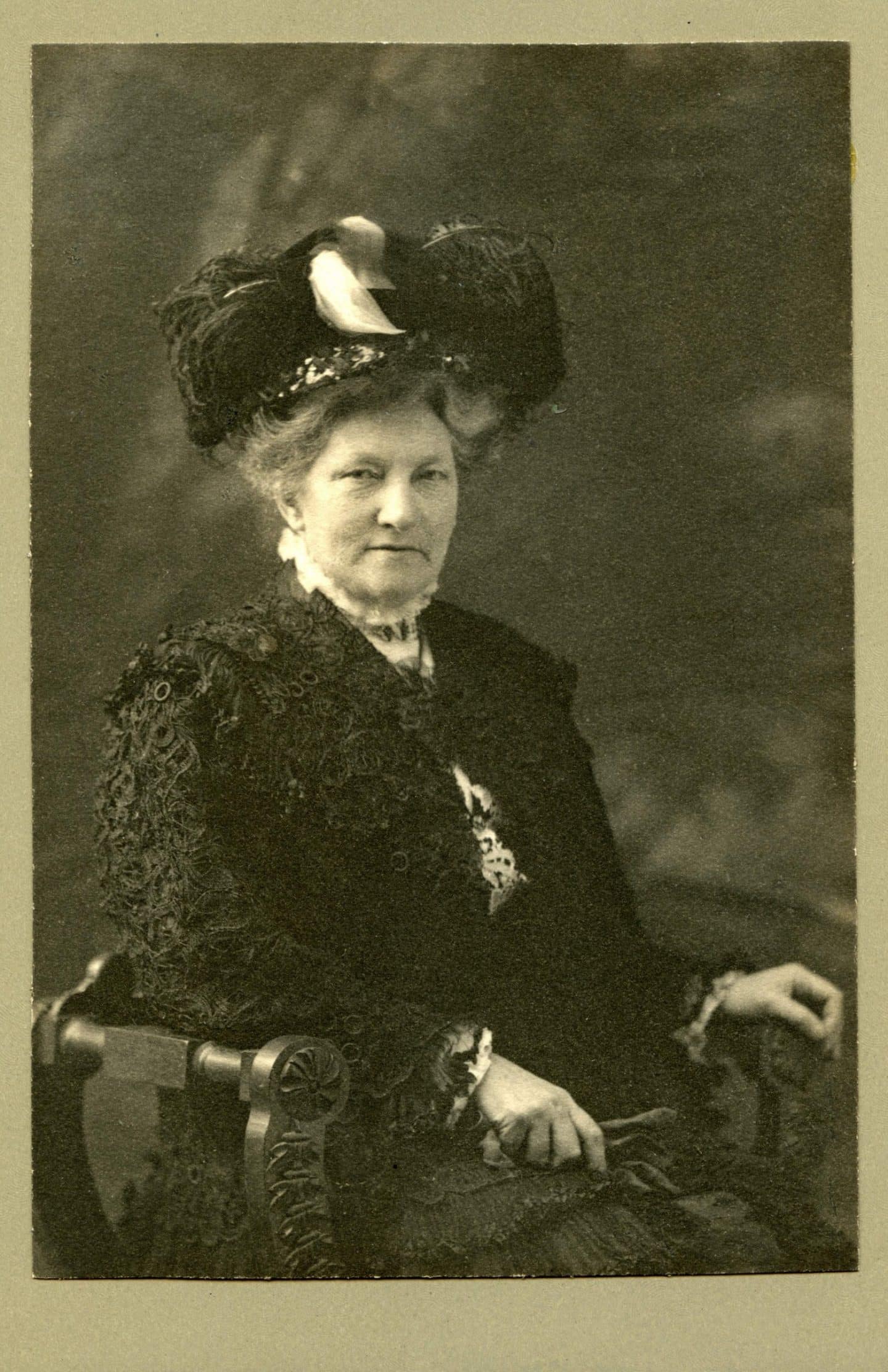
Today, people often assume black clothing is representative of historical mourning attire and refer to Queen Victoria for establishing the trend. Eliza Gordon, wife of Queen’s University President Daniel Miner Gordon, however, was not a widow. In wearing her black jacket (fig. 3), she was dressing in a style appropriate to her age group and level of society. By the end of the nineteenth century, dyes for any colour were available. As the colour palette for dresses broadened, black became the uniform colour of the business world. Judges, magistrates, lawyers and professors wore black. 4 Queen Victoria not only conveyed mourning by wearing black, she also placed herself at the top of the professional business world as ruler of the realm. Eliza Gordon was at the top of her social group as wife to a successful husband and the matriarch of her family. In wearing black, she placed herself on par with many successful men.
Despite its dark colouring, this jacket is anything but austere. Its jaunty, flared cut, floral embroideries, ruffles, and Peter Pan collar all symbolize light-hearted femininity. The organic layering of contrasting textures—heavy lace, tiny knife-pleated chiffon finished with satin ribbon, black velvet bow, and chiffon rosette—combine to express the fashionable aesthetic of the Art Nouveau period in dress. 5

FIG. 3 Eliza Gordon chose to wear her jacket in this photographic portrait. Textile mechanization of the early twentieth-century had made complex and compound materials widely available and very popular. A heavy black lace overlay of curvilinear floral and foliate design, appliqued circles, pleated chiffon and crepe, with black velvet ribbon, could look severe, but instead projects a light femininity.

FIG. 3 Eliza Gordon chose to wear her jacket in this photographic portrait. Textile mechanization of the early twentieth-century had made complex and compound materials widely available and very popular. A heavy black lace overlay of curvilinear floral and foliate design, appliqued circles, pleated chiffon and crepe, with black velvet ribbon, could look severe, but instead projects a light femininity.

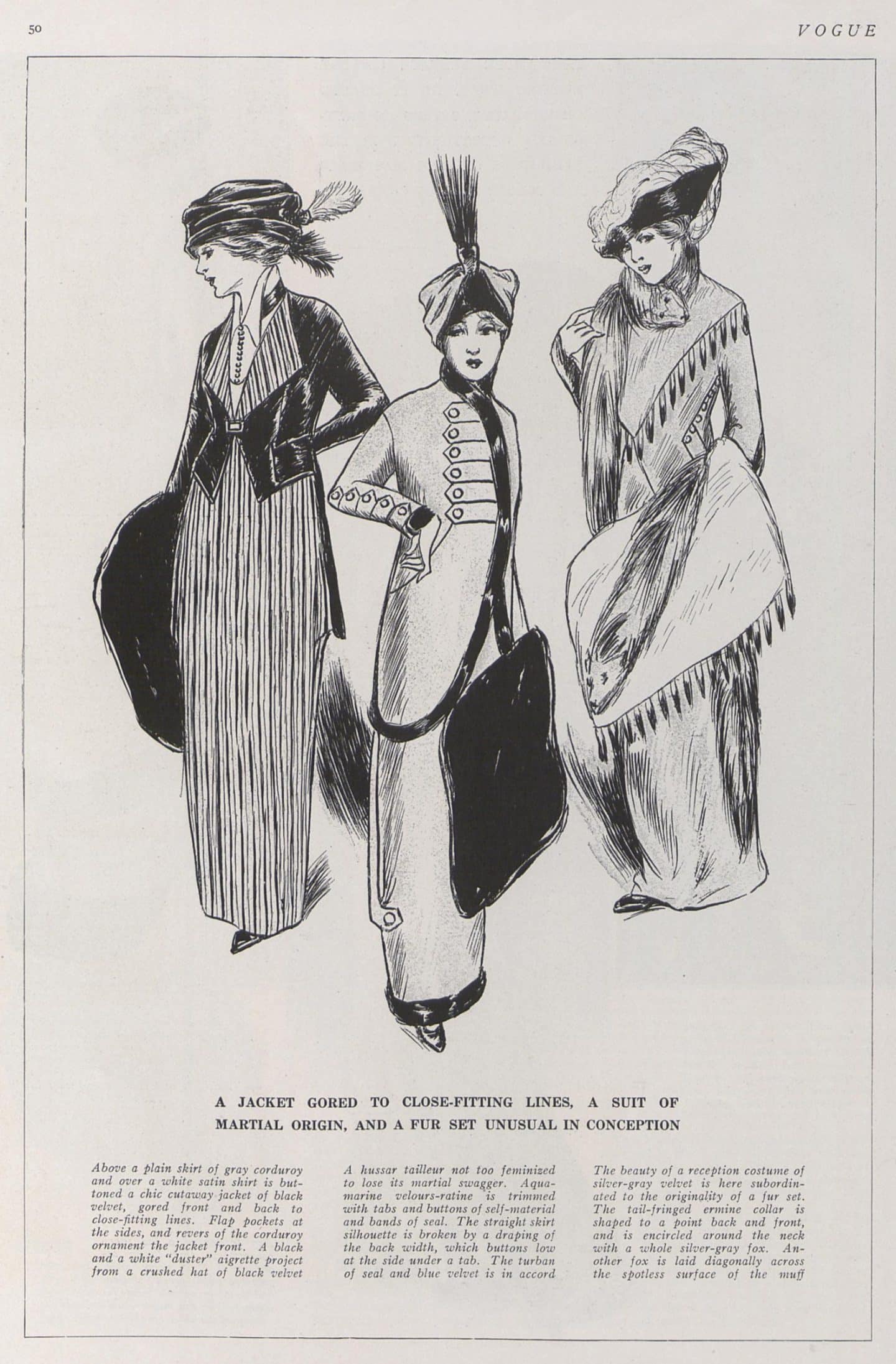
FIG. 4 A Vogue editor of 1912 claimed the central outfit on this page is “A hussa tailleur not too feminized to lose its martial swagger.” It mirrors elements of the dress suit with rows of braid and self-covered buttons. The long suit jacket projects a masculine stance.
The raw silk suit owned by Minnet Bridger, by contrast, projects a new, twentieth-century attitude with an abrupt departure from the overly fussy belle époque. Edwardian corsetry manipulated the body to form the famous “S” curve, which pushed the rib cage forward and the seat further backward. Instead, this suit’s silhouette was supported by a newly shaped corset that encased the hips, bringing them back in line with the torso to produce an erect stance and fashionable columnar shape. A long jacket, straight skirt, and tone-on-tone colouring work to reinforce the long, slim line.
Bridger was the wife of Professor W. R. P. Bridger, who taught at the Royal Military College in Kingston. The decorative detail is strongly reminiscent of the military trim of the Hussars Cavalry Brigades (fig. 4). Heavy, ivory soutache (decorative braid) and black velvet bands emulate rows of military gold braid and award ribbons. Loops of soutache, and hand-embroidered circles, imitate buttons and button holes along the length of the double-breasted jacket front and the sleeve cuffs. Military-like fringe is accomplished with knotted soutache. As a woman whose social connections were in the military sphere, this symbolism could not be lost on Minnet Bridger.
This suit has a strong masculine influence, but is very much a woman’s outfit. After half a century of colour development, this ensemble shows an appreciation for soft, natural colouring. Matching soutache is again used to render feminine style details. It delineates a flat collar and front jacket reveres, as well as jacket hem and sleeve cuffs. A touch of lace finishes the cuffs, while bright pink silk trim frames and highlights the face. These details take the garment out of an association with the military and herald a modern, emancipated woman.
EM
……..

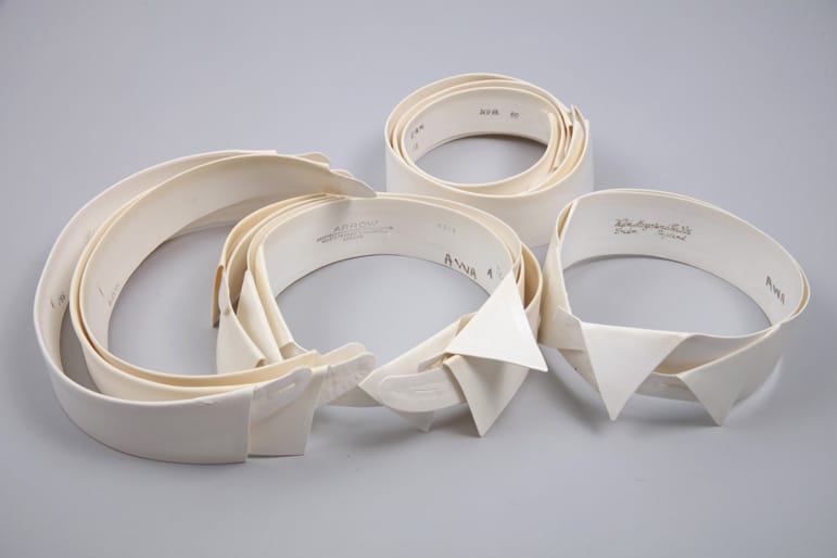
Various Makers (Arrow; Gieves; and Welch, Margetson and Company), Collars, 1910s, linen. Gift of Alistair Walker, 1988 (C88-670.6). Photo: Bernard Clark

Various Makers (Arrow; Gieves; and Welch, Margetson and Company), Collars, 1910s, linen. Gift of Alistair Walker, 1988 (C88-670.6). Photo: Bernard Clark

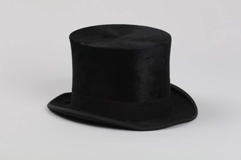
Christys’, London, for The 2 Macs, Ottawa, Hat, 1901–1910, beaver skin, corded silk and leather. Anonymous gift, 2009 (C09-004). Photo: Bernard Clark

Stepping Out: Clothes for a Gallery Goer, installation view, 2019. Photo: Paul Litherland
Collars: 1910s
When dressing for a social outing, perhaps for a trip to an art museum, a late-Victorian man would likely have exchanged his daytime or working business collar for a more elegant and relaxed style. A collection of white, stiffly starched collars in a variety of styles became a staple in men’s wardrobes toward the end of the nineteenth century and early twentieth century. Choosing the right collar for an occasion would have been directed by fashion trends of the day, to which men were exposed through advertisements in men’s magazines and department store catalogues. 6 Collar styles were also marketed with suggestive names that likely would have influenced a man’s daily selection. One can imagine that collar styles with militant or dominating sounding names such as “Commodore” or “Peerless” might have been donned for business-related functions. 7 By contrast, when dressing for an afternoon or evening at a gallery, perhaps a style with a more elegant or poetic moniker, such as the “Byronic” or “Winona” (fig. 5), might have been favoured.

FIG. 5 The “Winona” style collar, shown in this Arrow Collar advertisement from 1914, might have appealed to the gallery-goer as its marketing describes it as an “artistic” style.

FIG. 5 The “Winona” style collar, shown in this Arrow Collar advertisement from 1914, might have appealed to the gallery-goer as its marketing describes it as an “artistic” style.

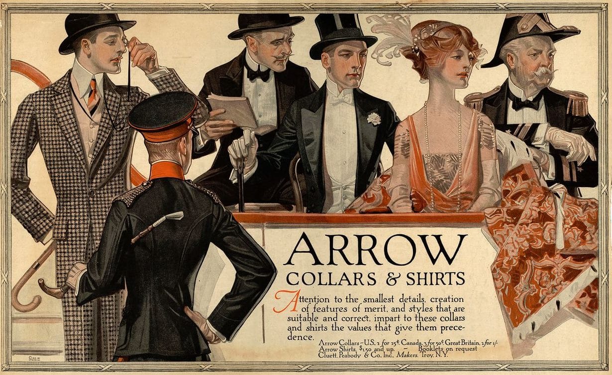
FIG. 6 This Arrow Collars and Shirts advertisement from 1913 showcases evening wear collar styles that are marketed as “suitable” and “correct.”
A box of detachable collars offered the luxury of choice and the ability to conform with rapidly changing fashion. From a practical perspective, a healthy collection of collars ensured that a clean collar, fresh from the laundry, was always at the ready. But a man’s collar collection also represented a box of social codes: each collar style was appropriate for very specific spaces and occasions and came loaded with connotations of class, position and identity. As outward class distinctions blurred in the second half of the nineteenth century, subtle fashion codes came to serve as revealing markers of class identity. As a new consumer market of working and middle-class “mashers” strove to imitate higher class styles, fashion became a visual language of discriminating details, and collars were scrutinized for their cut, the quality of their materials, and state of cleanliness and finish in which they were worn. 8 Advertisements for higher-end collar brands, such as Arrow Collars (fig. 6), offered reassurances that their styles were regarded as respectable and on-trend. Household receipt books and magazines were filled with recommendations for housekeepers and laundresses on how to achieve the ideal stiff, glossy finish on collars, which endowed their wearers with the appearance of dignified and restrained gentility.
A selection of detachable starched linen collars in the Queen’s University Collection of Canadian Dress were examined as part of the 2017 Isabel Bader Fellowship in Textile Conservation and Research. Certain collars in the collection are so highly finished that they had been previously misidentified as plastic. A minute sample of a collar’s finish was analyzed and found to contain not only starch, but also traces of gum tragacanth, which would have been used to increase the collar’s glossy appearance and help prevent the iron from sticking during pressing. The collar analysis illuminated the practices of the laundress who once cared for it. These methods are not insignificant, as it was the hard work of the laundress that kept a man’s supply of collars clean, crisp and socially acceptable, ready for him to select and don, along with a top hat, before stepping out into the public eye for whatever social occasion awaited him.
SZ
……..

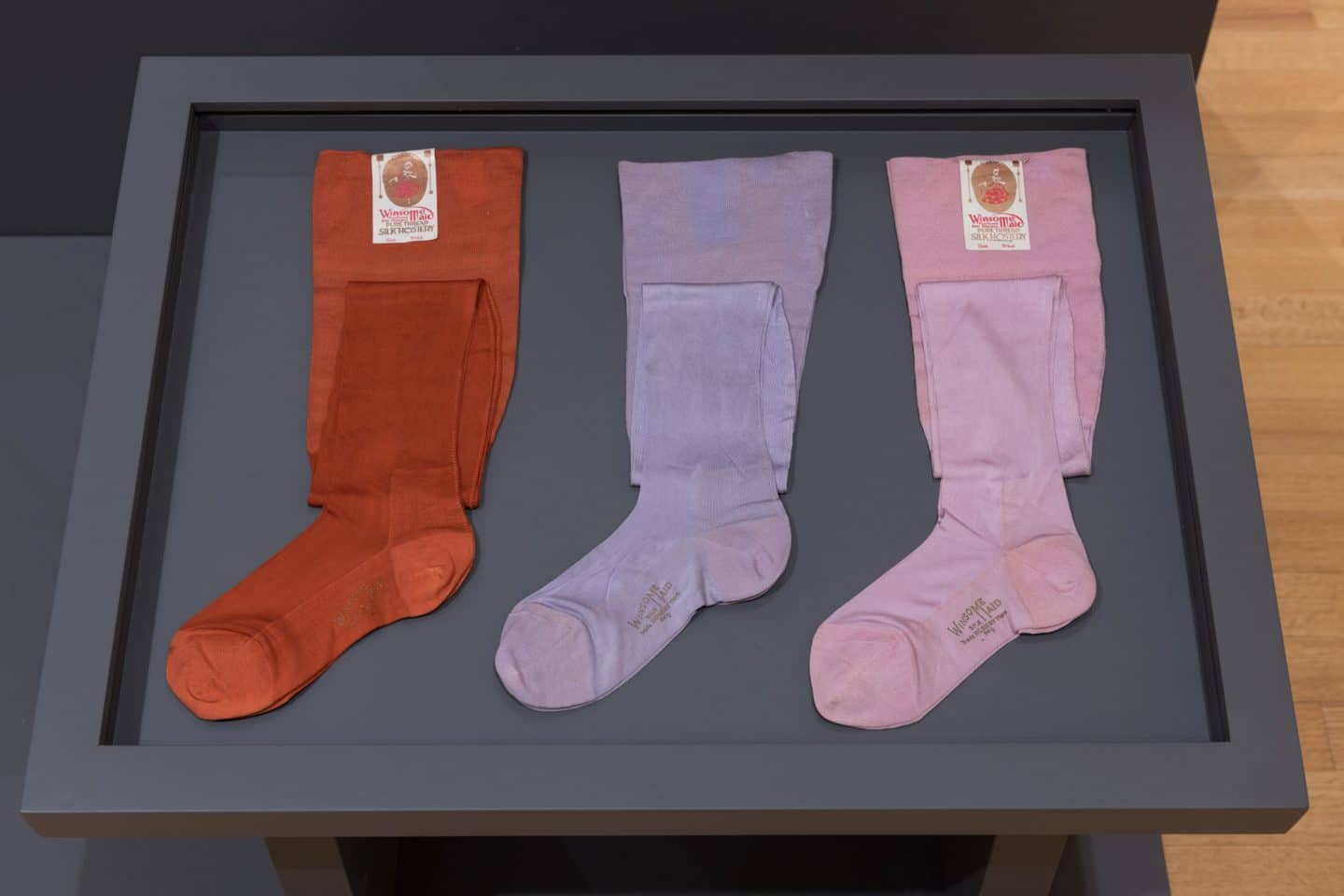
Allen Silk Mills, Canada, Stockings, 1920s, silk. Anonymous gift, pre-1948 (C48-277.1, C48-278.1, C48-279.1). Photo: Paul Litherland

Allen Silk Mills, Canada, Stockings, 1920s, silk. Anonymous gift, pre-1948 (C48-277.1, C48-278.1, C48-279.1). Photo: Paul Litherland

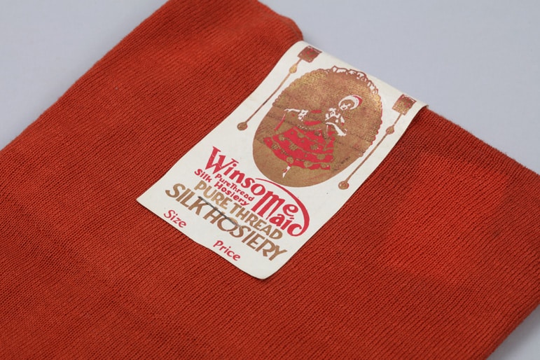
Allen Silk Mills, Canada, Stockings (detail), 1920s, silk. Anonymous gift, pre-1948 (C48-279.1). Photo: Bernard Clark

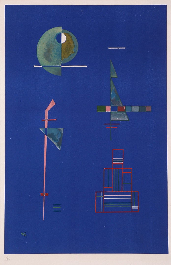
Wassily Kandinsky, Untitled, 1929, lithograph on paper, 21/150. Purchase, George Taylor Richardson Memorial Fund, 1970 (13-110). Photo: Bernard Clark

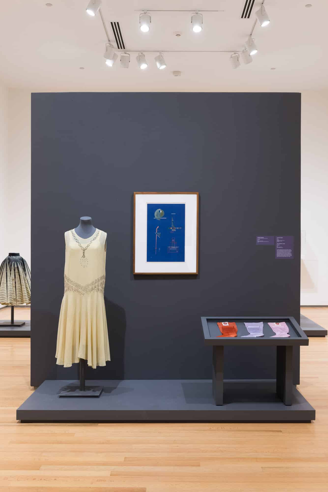
Stepping Out: Clothes for a Gallery Goer, installation view, 2019. Photo: Paul Litherland

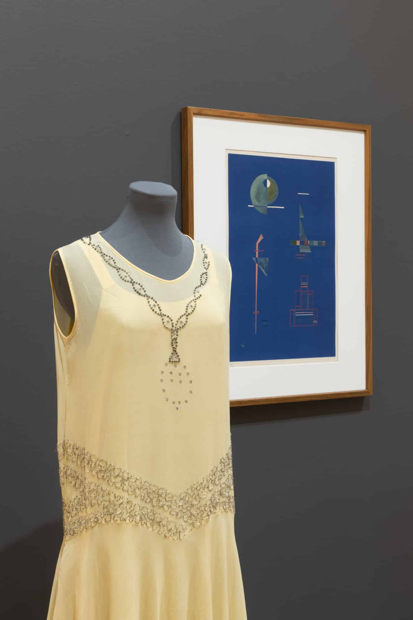
Unknown Maker, Dress (detail), 1927–1932, georgette, rayon, metal and rhinestones. Gift of Parks Canada, 1990 (C91-734.52). Photo: Paul Litherland
Stockings: 1920s
“In olden days, a glimpse of stocking
Was looked on as something shocking
But now, God knows,
Anything goes.”
—Cole Porter 9
British psychoanalyst John Carl Flugel, a more academic, though obviously smitten, observer of current fashion announced in 1930, “Legs have emerged after centuries of shrouding, and adult woman at last frankly admits herself to be a biped … her ankles, calves, and knees (all the more dazzling in their suddenly revealed beauty after their long sojourn in the dark) [are] her chief erotic weapons.” 10
Personal and easily damaged items such as these colourful stockings are rare in museum collections. Their ephemeral quality provides a glimpse into the zeitgeist of the time and the values of the young woman who folded and tucked them into her dresser drawer.
Winsome Maid Silk Hosiery, made by Allen Silk Mills, was advertised for sale in Canadian newspapers from Ottawa to Victoria between 1920 and 1926. 11 The modern Art Deco label seems at odds with the romanticized image of the Victorian maiden exposing an ankle. This may be nostalgia for a simpler time, but may also give subtle consent to a flapper culture to show an ankle “just as grandmother did.” It suggests a modern woman could hold older values.
The 1920s brought about dramatic change for women who stepped out of the home and into the workforce in ever increasing numbers. 12 Some filled job vacancies left by men lost during World War I. Others found the route to the social sphere through education. In Ontario, the Adolescent School Attendance Act of 1919 raised the legal age for leaving school to sixteen years, resulting in more young women who qualified for the job market and professional schools. 13 For the first time, a large group of women with earning power had money for unnecessary and frivolous items like coloured stockings. Those who attended Queen’s University kicked up their heels at weekly dances despite the disapproval of the school’s administration, who submitted that dance promoted irresponsible behaviour. 14

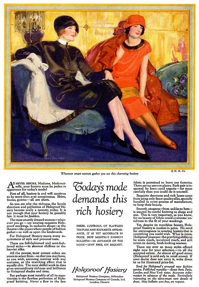
FIG. 7 This 1925 advertisement for another popular brand, Holeproof Hosiery, demonstrates how coloured stockings could either compliment or match an outfit.

FIG. 7 This 1925 advertisement for another popular brand, Holeproof Hosiery, demonstrates how coloured stockings could either compliment or match an outfit.

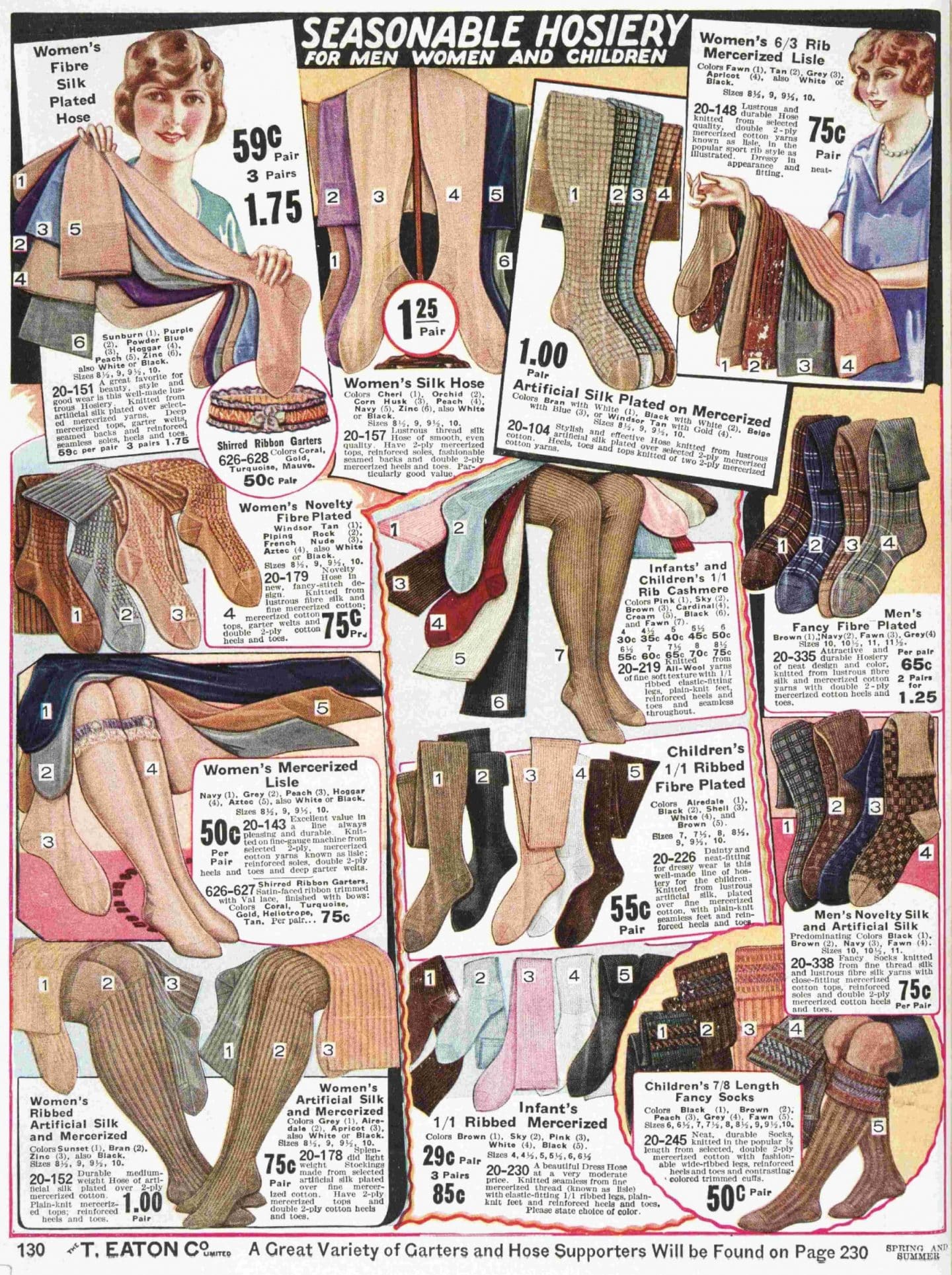
FIG. 8 This page, from Eaton’s 1926 spring and summer catalogue, shows just a portion of the vast choice of hosiery colours and styles that Canadians enjoyed.
As dresses shrunk, and legs were increasingly the object of an admirer’s gaze, hosiery manufacturers stepped up to provide dozens of options from which to choose (fig. 7). Stockings were either tapered at the ankle during the knitting process or knitted flat and seamed along the back with a darker thread. Seamed stockings had visibly darker heels shaped as a square or pyramid shapes, which had the dual benefits of attracting attention and visually slenderizing the ankle. 15 Catalogues distributed by large Canadian department stores, such as Eaton’s and Simpson’s, advertised hose in a variety of yarns: cotton, wool, cashmere, fleece-lined silk, rayon, and wool blends. Hosiery could be shiny or matte, textured with lacy stitches, or embroidered. In the early 1920s, colours of navy, black and a variety of skin tones sufficed, but when skirts reached their shortest lengths in 1927, there were enough colours to match any outfit. Colours such as sunburn, orchid, purple, powder blue, peach, pink, cardinal, zinc, as well as black and beige adorned Eaton’s department store’s 1926 spring and summer catalogue (fig. 8).
This flirtation with coloured stockings was brief. Within a couple of years, choice was again reduced to pre-1920s colouring. A broad range of stocking colour would not be seen again until the 1960s, when the mini-skirt again exposed women’s legs.
EM
……..

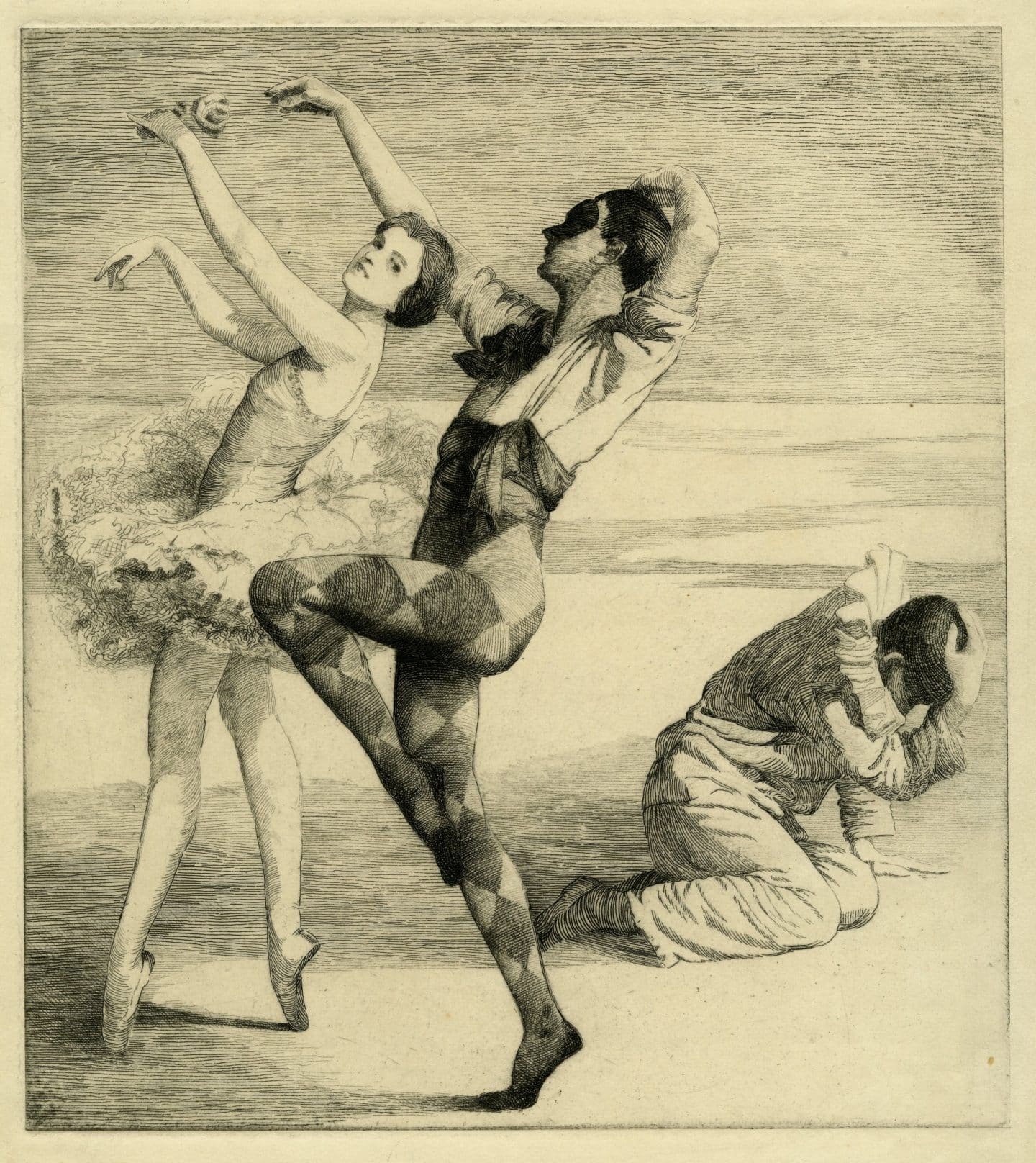
Isobel Hogg, Untitled (Two Ballet Dancers with Seated Figure), 1929, etching on paper. Purchase, Consolidated Purchase Fund, 1980 (23-042.07). Photo: Agnes Etherington Art Centre

Isobel Hogg, Untitled (Two Ballet Dancers with Seated Figure), 1929, etching on paper. Purchase, Consolidated Purchase Fund, 1980 (23-042.07). Photo: Agnes Etherington Art Centre

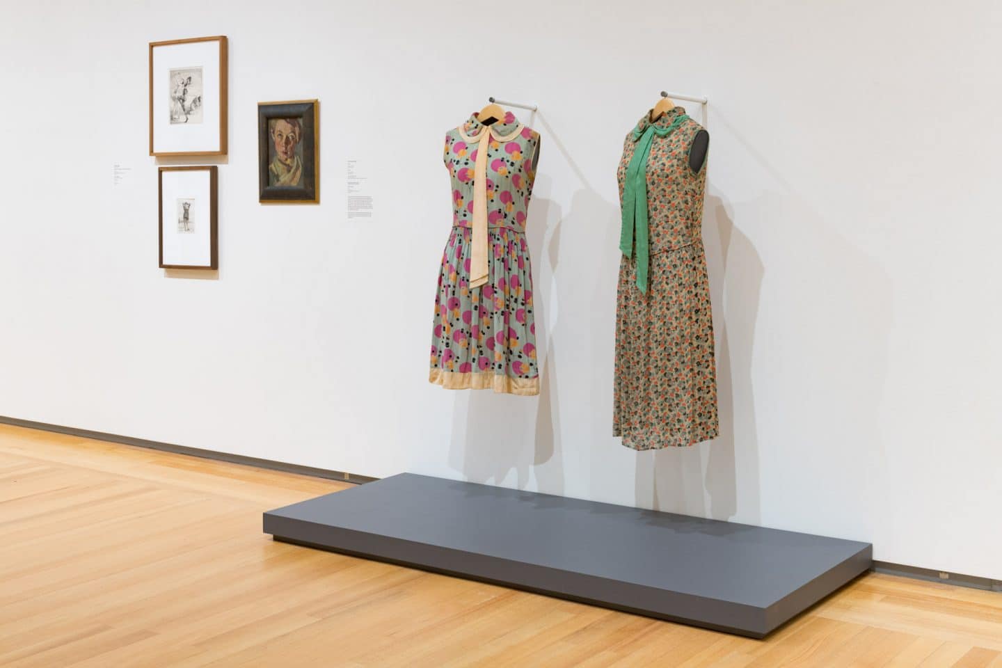
Unknown Maker, Dresses, around 1924–1929, rayon and metal. Gift of Marilyn Bennett, 2005 (C05-002.15 and C05-002.16). Worn by Claire Ellen “Penny” Penman Bennett. Photo: Paul Litherland

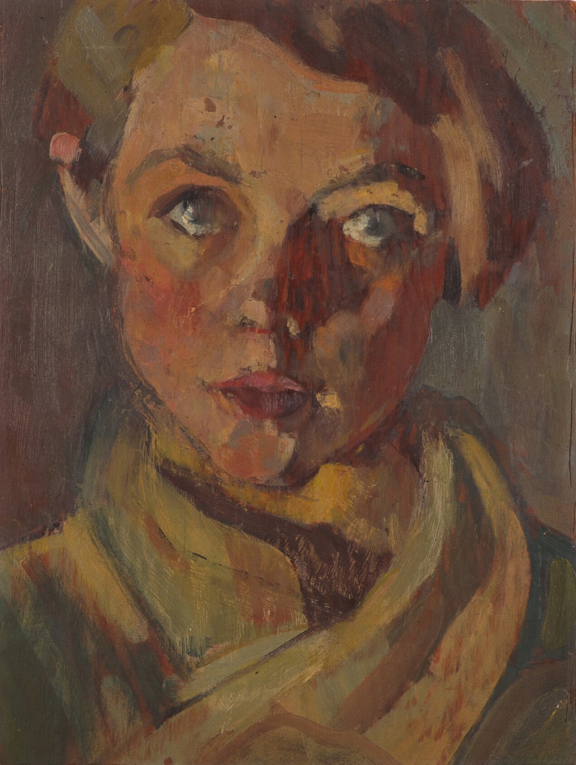
Pegi Nicol MacLeod, Self-Portrait, 1928, oil on plywood. Gift of the Estate of Richard Finnie, 1995 (38-013.02). Photo: Bernard Clark

Unknown Maker, Dress (detail), around 1924–1929, rayon and metal. Gift of Marilyn Bennett, 2005 (C05-002.15). Worn by Claire Ellen “Penny” Penman Bennett. Photo: Paul Litherland

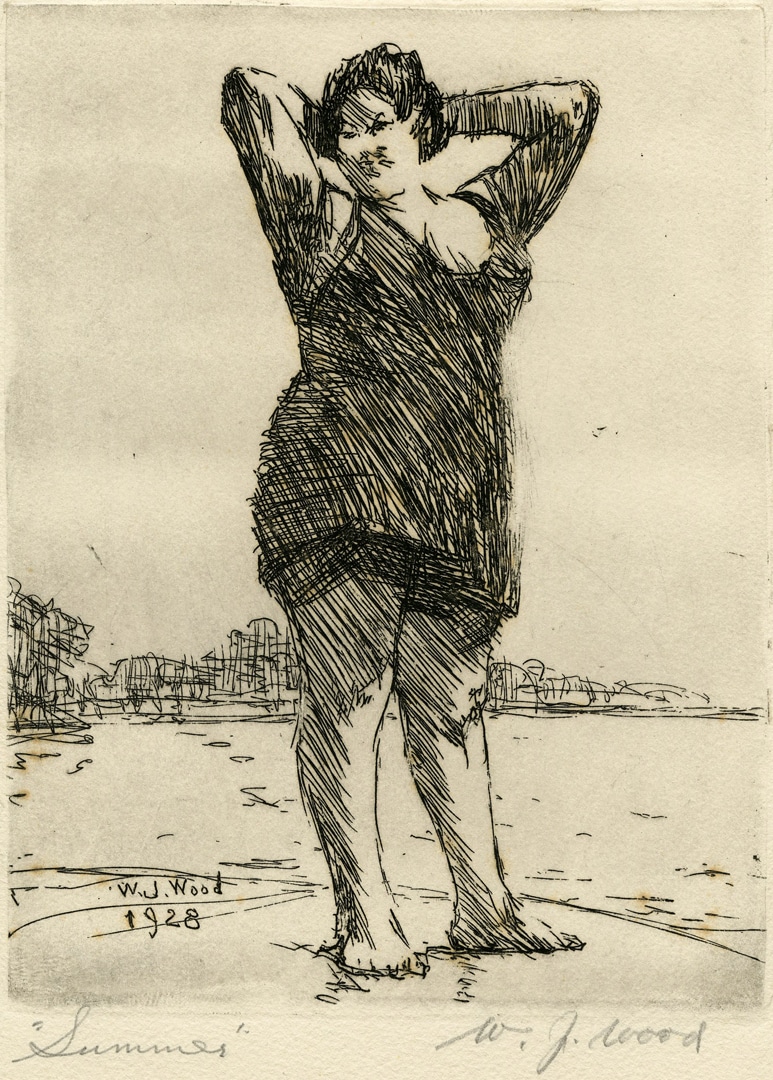
W. J. Wood, Summer, 1928, etching on paper. Gift of Gordon Conn, 1964 (20-073.37). Photo: Agnes Etherington Art Centre
Dresses: 1920s
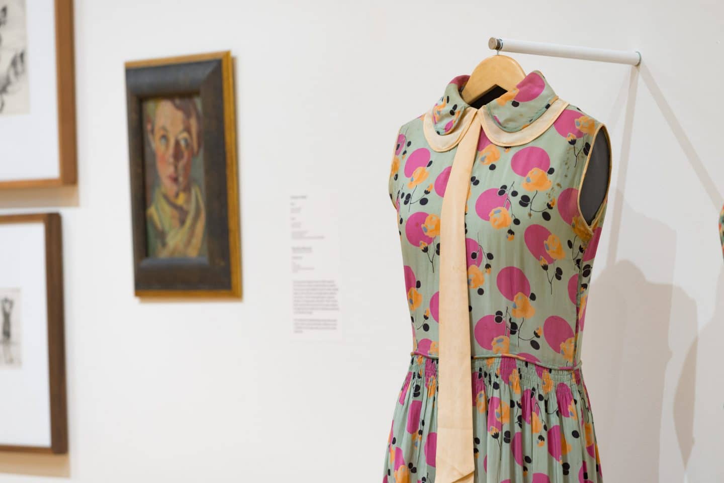
This pair of 1920s day dresses embodies much of the spirit of modernity associated with that decade. Art Deco-style printed fabrics reflect the new aesthetic of the period while the dress styles personify youthful exuberance. The graphic and stylized floral print of the blue, pink and orange dress with pale peach collar, necktie and hem band accents is an especially illustrative example of these bold trends, with its strong colour palette and large-scale motifs. The dress textiles of viscose rayon crepe—among the earliest “man-made” fibres—are also typical of this period. Although rayon was initially developed in the late nineteenth century, it first came into widespread use as a garment fabric during the 1920s, heralding the world of modern synthetic textiles. 16 The short skirts and straight bodies of the dresses evoke the phenomenon of the young “modern” woman concurrently in ascendance with her fashionably boyish or garçonne silhouette. 17 Although a softer version of this silhouette evolved over the previous decade, it starkly contrasted against the exaggerated hourglass of the century’s beginning. Women enjoyed greater liberty and a wider range of possibilities than ever before and this was reflected in the appearance of less cumbersome, restrictive and complicated clothing. The world that emerged from the war’s ashes almost seemed to belong to these “new” women, who had won the right to vote in Canada and proven their capability at keeping society and industry running while the men were away. The original owner of these dresses, Claire Ellen “Penny” Penman Bennett, epitomized the essence of this new age. She was in her mid- to late twenties around the time these frocks were made and worn. She graduated from nursing school at Kingston General Hospital in 1925, and continued her nursing career well after marrying Dr Clifford Bennett in 1928.
The comfortable fit and casual styling of these dresses earmark them as daywear. But their neat Peter Pan collars with contrast-coloured under collars and neck draperies are smart, giving a nod to men’s shirts and ties. The carefully executed details of piped waistlines, bias bindings around the armholes and collar edges, the discreet left-hand side seam snap fastenings and especially the multiple rows of shirring that gather the skirts into the bodices bespeak highly skilled hands behind their construction, whether custom-made or commercially produced. The colours, patterns, styles and manufacture of these dresses may be fun but they are not frivolous. They are, in fact, just the thing for a pair of young, independent-minded women to wear for a spring or summer’s day outing to an art gallery or exhibition. A self-portrait of Pegi Nicol MacLeod on display here conveys a confident, stylish bearing, suggesting that these “bright young things” could see themselves reflected not only in the art shown at exhibitions of the newest works but in the artists as well.
CD
……..

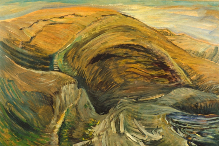
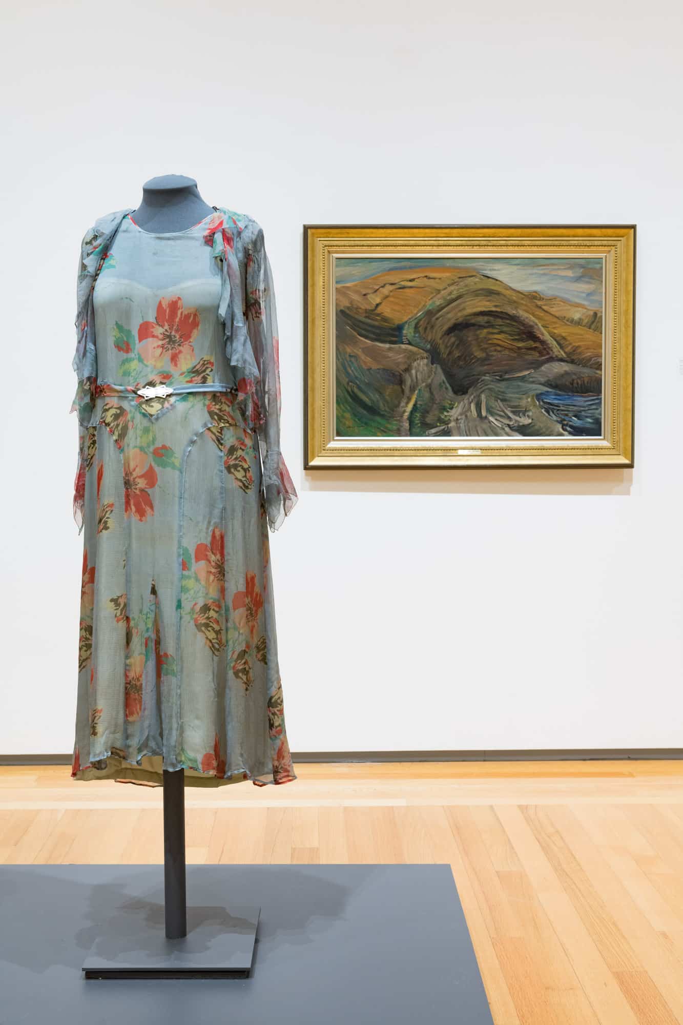
Emily Carr, Bay and Mountain, around 1937, oil on paper, mounted on plywood. Purchase, Alcan Canada Products Ltd, Chancellor Richardson Memorial Fund, George Taylor Richardson Memorial Fund, the Gallery Association and private sources, 1983 (26-025). Photo: Paul Litherland

Unknown Maker, Dress, 1925–1932, silk. Gift of Marilyn Bennett, 2005 (C05-002.1). Worn by Claire Ellen “Penny” Penman Bennett. Photo: Paul Litherland

Emily Carr, Bay and Mountain, around 1937, oil on paper, mounted on plywood. Purchase, Alcan Canada Products Ltd, Chancellor Richardson Memorial Fund, George Taylor Richardson Memorial Fund, the Gallery Association and private sources, 1983 (26-025). Photo: Paul Litherland

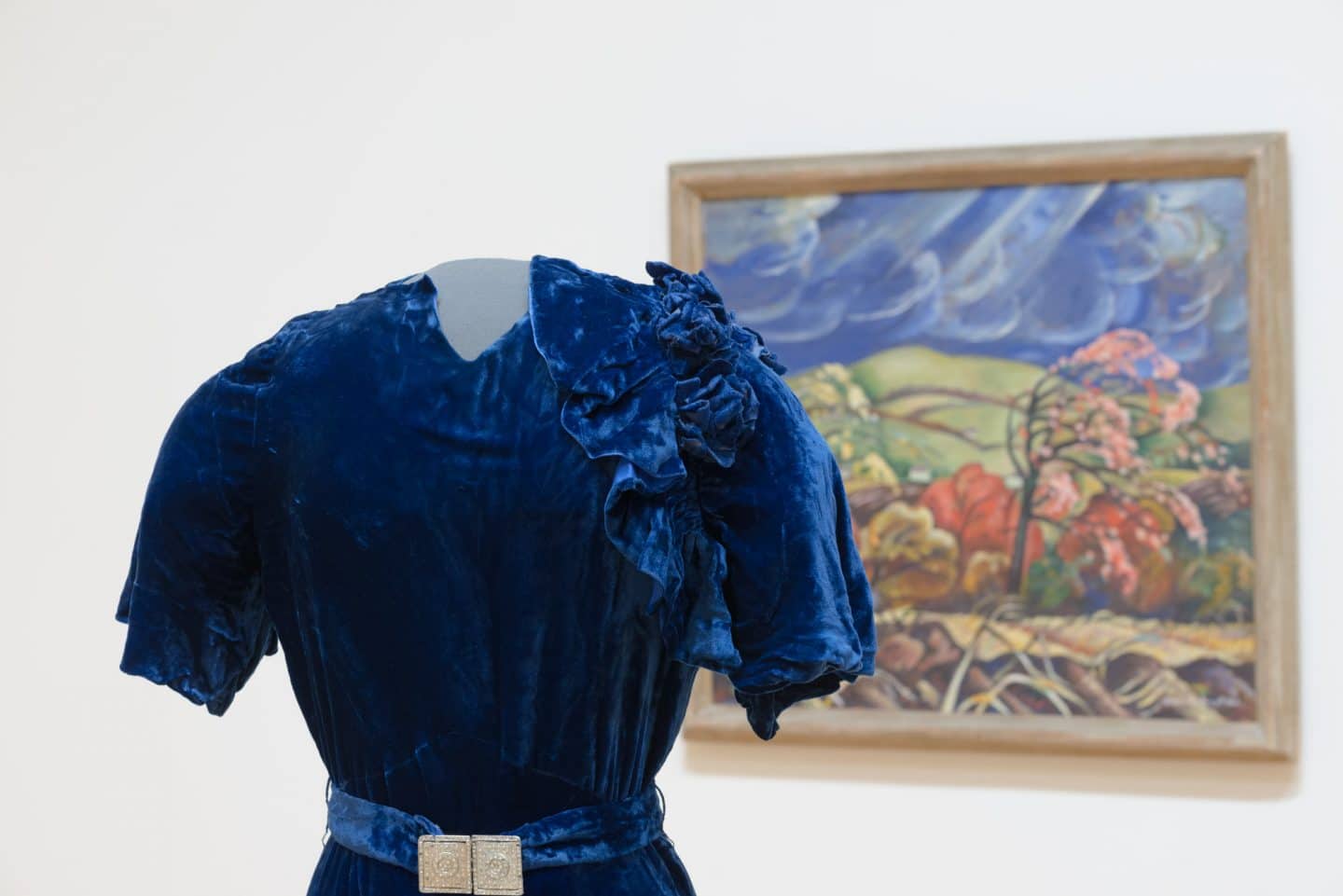
Unknown Maker, Dress (detail), around 1934, velvet, metal and rhinestones. Gift of Susan Groom Patterson, 1988 (C91-721.01). Worn by Susan Groom Patterson. Photo: Paul Litherland

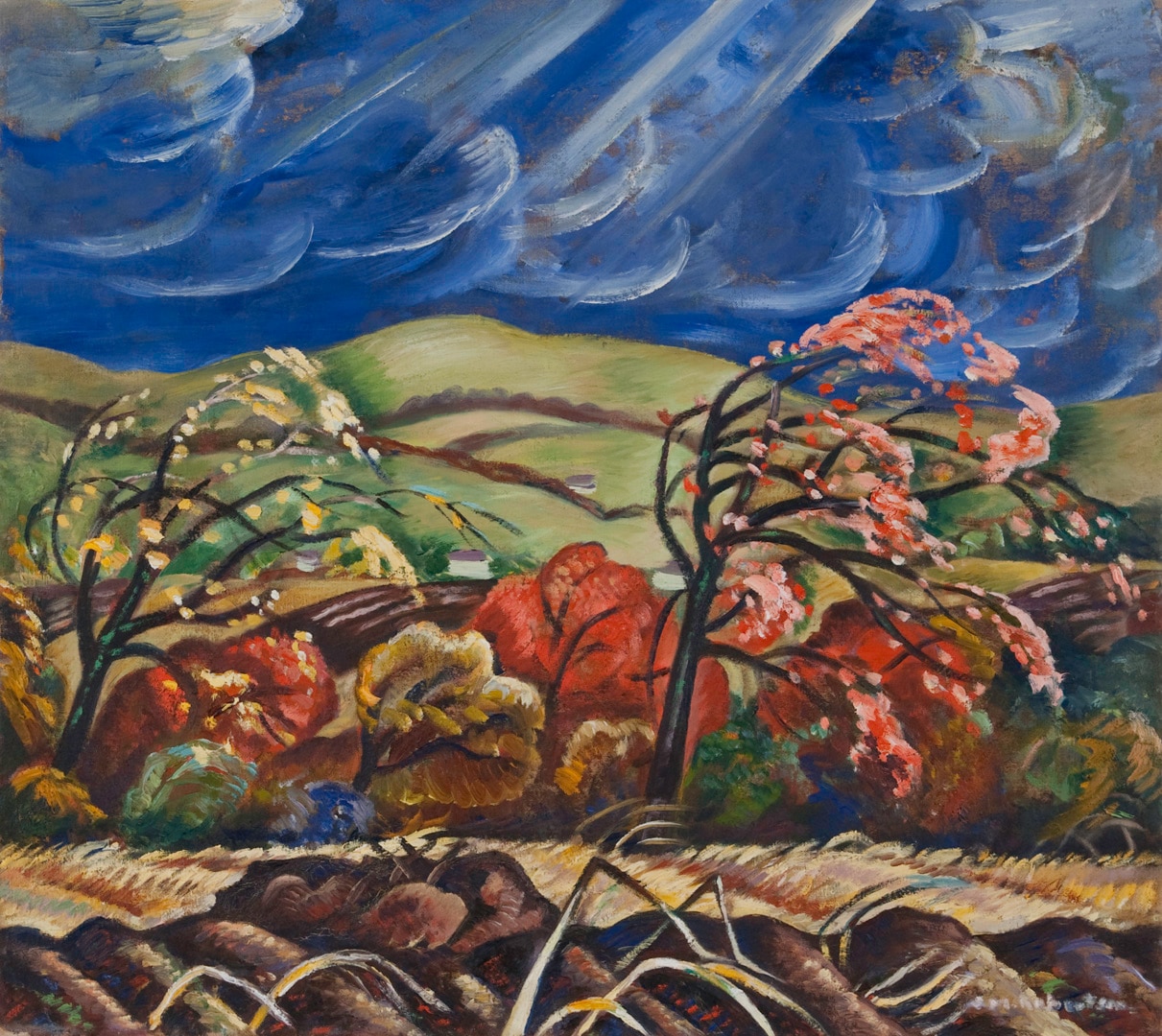
Sarah Robertson, October, Ottawa Valley, around 1937, oil on canvas. Purchase, Chancellor Richardson Memorial Fund and Wintario matching grant, 1978 (21-029). Photo: Paul Litherland

Stepping Out: Clothes for a Gallery Goer, installation view, 2019. Photo: Paul Litherland
Dresses: 1930s
Fashion’s quick response to the world economic depression was a return to ultra-feminine designs, and longer hem lengths. Body hugging bias cuts, flowing crepe fabric, ruffles and sensuous velvets defined femininity in the 1930s. Silhouettes were described as “sheath-like contours” that were “topped and terminated with a flutter.” 18 The natural waist was rediscovered and defined by a narrow belt, often with a decorative buckle. Women looked to the movies, magazines, department store catalogues, and dress pattern companies for the latest fashions.
The garments displayed here show two sides of femininity.
The first is a spring ensemble in colours of soft green, yellow and mellow red, worn by an older Claire Bennett. The large floral print is a departure from the intricate beaded designs or small-scale Liberty prints of the 1920s and brings youthful energy to the garment. Ruffles around the jacket front and sleeves reinforce the theme of soft feminine curves and fluid movement. Dress designers cleverly inserted quadrants of fabric called godets to add graceful volume to a dress hem while keeping the hips smooth. In this dress, godets shaped in characteristic Art Deco waterfall arcs add both curves and body lengthening seams to the garment.
This ensemble shows a strong influence of French couture designer, Madeleine Vionnet. Vionnet’s draped designs increased in popularity throughout the 1920s, but it was during the 1930s that her influence was seen in dresses from catalogue to couture gowns. Even tissue paper dress patterns sold for home construction referred to Vionnet’s designs. Her most identifiable style feature was the bias cut. The bias of fabric is an invisible diagonal line bisecting the warp and the weft yarns. It is the area between threads and as such, has no integral structural strength of its own. Instead, it takes the shape of what it envelops. Soft fabric, draped on the bias, hangs smoothly over the wearers’ hips.

FIG. 9 Pattern companies such as McCall’s, Butterick and Vogue, sold patterns for the home sewer through magazines that included short stories and homemaking advice in addition to the latest fashions. Many of the patterns were made by, or heavily influenced by, famous designers of the area, including Vionnet, Sciaparelli, Lanvin and Patou.
The second dress shows the sensual side of femininity. Strong, textural fabrics were popular in autumn and winter for both day and evening wear. 19 Velvet was often combined with contrasting rich textures such as fur, satin or wool. This sophisticated silhouette is slim over the hips with only a small flare from the knee to the hem. An asymmetric capelet, lined in bright blue satin and topped with velvet roses, brings interest to the neck area. Fully gathered sleeve caps and high “v” neck add to the sense of height and elongation. A back closure, typical for the period, is decorated with a row of buttons and jewelled clasp. The dress is completed with a deco clasp belt.
The deep blue colouring of the dress may have been due to a new synthetic pigment called Windsor blue, or Phthalo blue, which was developed in the 1930s. The new pigment had the deep richness of Prussian blue without its fugitive characteristics of becoming unstable under light or moisture. It became a popular colour in ceramics, glass, paintings and clothing throughout the 1930s.
Both of these dresses show a complexity of design, with shoulder ruffles and elongated silhouettes, which indicates they were meant to be worn to a special event. Evening wear was either floor length or slightly trained, but this mid- to low calf length was popular for an afternoon or dinner event (fig. 9). Either would be perfect for a gallery visit.
EM
……..

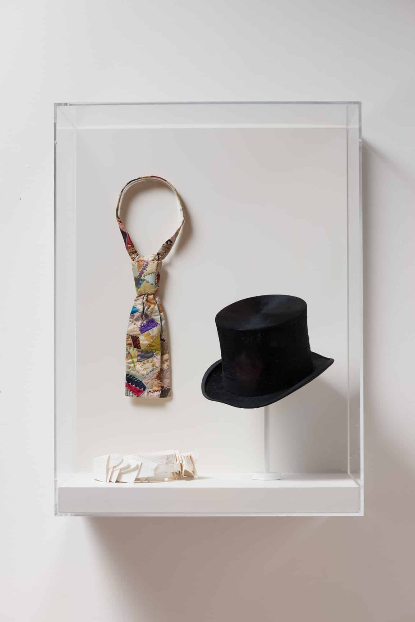
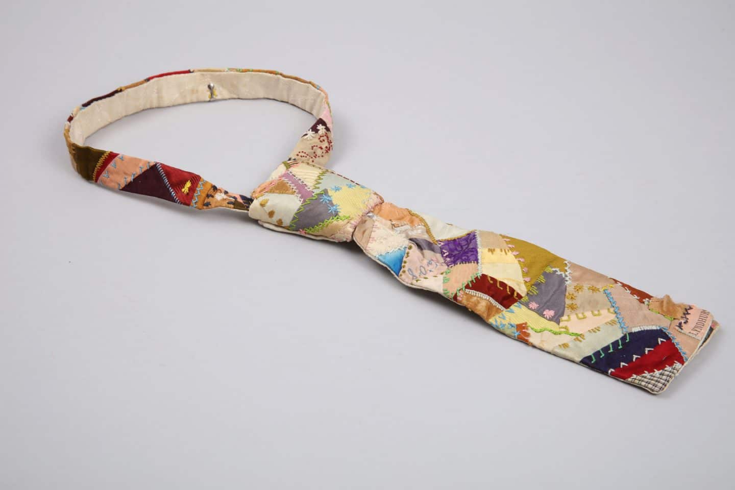
Estelle Cheetham Green, Quilted Tie, late 1890s, cotton and silk. Gift of Paul Fritz, Arts ‘61, 2013 (C13-003.02). Worn by Robert Edward Green. Photo: Bernard Clark

Estelle Cheetham Green, Quilted Tie (detail), late 1890s, cotton and silk. Gift of Paul Fritz, Arts ‘61, 2013 (C13-003.02). Worn by Robert Edward Green. Photo: Bernard Clark

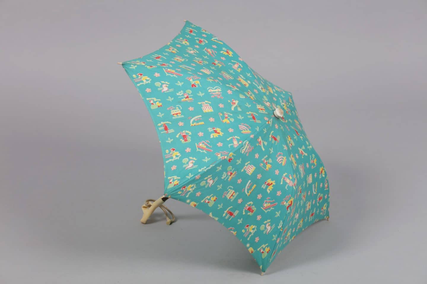
Unknown Maker, Dress, with Parasol, 1939–1940, cotton, metal, wood and plastic. Gift of Lois Corbett, 2016 (C16-001). Worn by Lois Corbett. Photo: Bernard Clark

Unknown Maker, Dress, with Parasol (detail), 1939–1940, cotton, metal, wood and plastic. Gift of Lois Corbett, 2016 (C16-001). Worn by Lois Corbett. Photo: Bernard Clark

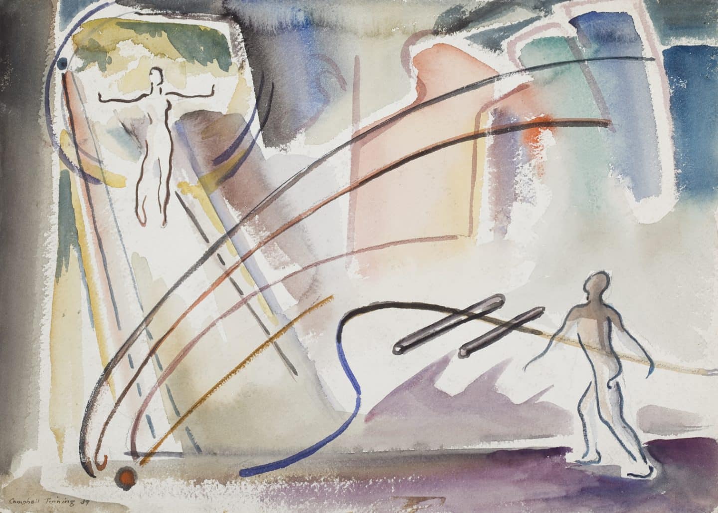
George Campbell Tinning, Untitled, 1939, watercolour on paper. Gift of Elizabeth and Robert Bowes, 2011 (54-009.04). Photo: Bernard Clark

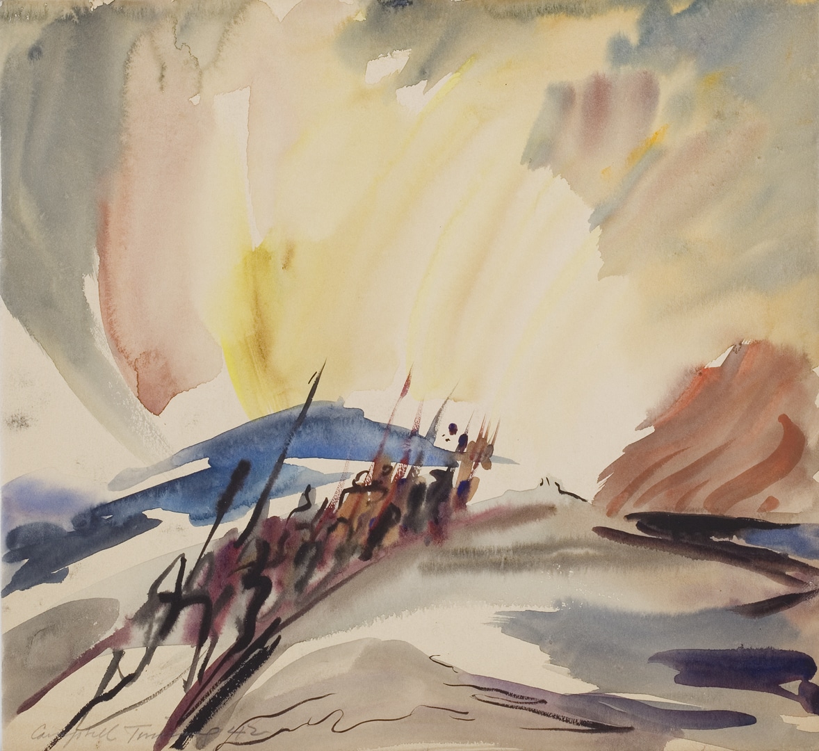
George Campbell Tinning, Sibelius 2nd Symphony, 1942, watercolour on paper. Gift of Elizabeth and Robert Bowes, 2011 (54-009.03). Photo: Bernard Clark
Tie and Dress: 1890s and 1930s
Seemingly worlds apart as sartorial wear, this 1890s men’s tie and 1930s girl’s dress have something in common. 20 Each features souvenir fabrics that speak to outings and advertise place. Where the wearer or purchaser had been is literally spelled out in printed text.
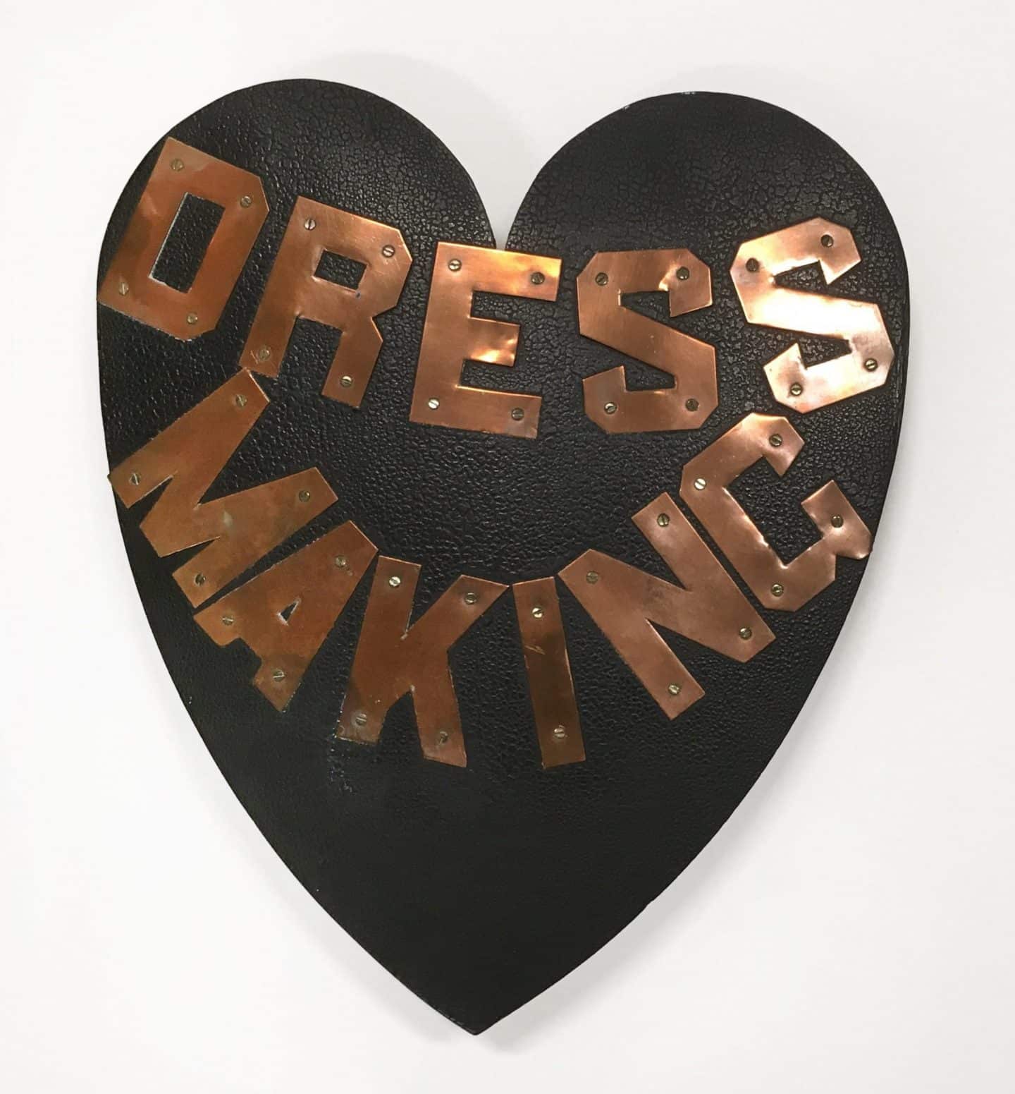
Victorians loved souvenirs, assembled into scrapbooks and crowded onto shelves. The crazy quilt, which rose to popularity in the late nineteenth century, was itself an album of mementos, incorporating embroidered words and fabric scraps laden with meaning, often tied to an intimate familial or social circle. 21 When Robert Green was courting Stella Cheetham, a Lyndhurst, Ontario dressmaker, she gave him this tie as a gift. Silks from men’s ties often formed part of quilts, but in this case, the tie is the quilt. Similar to a crazy quilt in construction and sentiment, the tie showcases Cheetham’s embroidery skills, each patch edged in a variety of stitches. Discretely yet deliberately, she inserted what appears to be a printed Lyndhurst Fair souvenir ribbon, perhaps the site of one of their rendezvous. Crazy quilting was popular fancywork in the late nineteenth century, usually reserved for bed covers, parlour throws and sofa pillows. Here it imparts artistic flare to Robert Green’s one-of-a-kind tie. Later, Green would make his talented wife her own dressmaking sign to hang outside their home in Delta (near Lyndhurst), as advertisement of her craft (fig. 10).

FIG. 10 Estelle Cheetham Green’s dressmaking sign, made by her husband Robert Edward Green, late nineteenth century.
The girl’s dress, too, has fair connections. Brought back for the wearer by her aunt from the 1939 New York World’s Fair, it is printed with playful images and names representing child-friendly sites in New York City: Washington Bridge, Central Park, the Battery and the Empire State Building combine with more generic urban features of The Zoo, The Hurdy Gurdy, The Playground, Flower Cart, The Bus and The Station. In period pastels of aqua and yellow, the dress is embellished with puffed sleeves and a high-necked collar, similar to what Judy Garland wore as Dorothy Gale in The Wizard of Oz movie, released that same year. Girls’ dresses in the late 1930s were often fashionably cinched at the waist with a belt, imitating women’s clothing. This dress once had a matching belt, but its fabric was used to alter the much-loved garment for a growing girl. The cheerful pattern expresses the optimism of the World’s Fair, with its theme “Building the World of Tomorrow,” as North America was recovering from economic crisis, prior to the outbreak of World War II. The stylish handle of the matching parasol represents advancements in synthetic plastics embraced by the fashion industry, and celebrated at the Fair. As souvenirs, the dress and parasol ensemble is an early modern example of the use of printed fabric in clothing for promotional purposes.
AB
……..

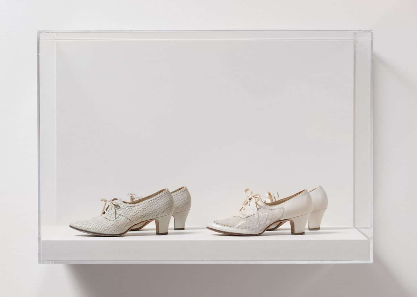
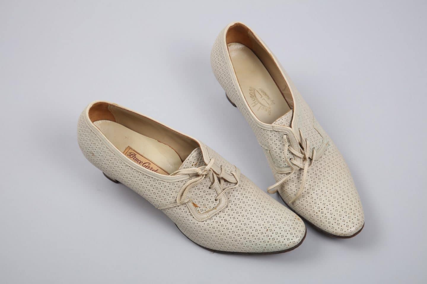
Left to right: Bruce Cardwell’s, Toronto, Shoes, 1940s, leather. Gift of Mrs Rodden and Easton, 1983 (C83-659.5); Selby Shoe Co., Portsmouth, Shoes, 1940s, leather. Anonymous gift, 1988 (C88-709.1). Photo: Paul Litherland

Bruce Cardwell’s, Toronto, Shoes, 1940s, leather. Gift of Mrs Rodden and Easton, 1983 (C83-659.5) Photo: Bernard Clark
Shoes: 1940s
When thinking of the visitor experience in an art gallery space, we typically focus on interactions between the eyes and mind: the different ways of seeing art and interpreting it. Rarely do we consider our feet, which carry us through these spaces and hold us in front of works while we contemplate them. However, feet and, more particularly, the shoes encasing them have often announced their presence more audibly in the hushed environs of galleries than in our other everyday surroundings.
These mid-twentieth century women’s shoes from Toronto label Bruce Cardwell’s and Portsmouth, Ohio brand Selby Shoe Co. provide an ideal case in point. Made in smart, classic spectator styles, these pairs of shoes, both with cotton mesh uppers and white leather detailing, could easily have been chosen to wear for a daytime outing to a gallery or museum. Their colours and styles distinguish them as part of the “sportswear” of their time: comfortable and casual yet stylish fashions. As with most women’s shoes over the twentieth century, they are moderately high-heeled and leather-soled. As such, these shoes would create distinctive clicking noises across the hardwood, marble or concrete floors of galleries, broadcasting their wearer’s progress through the rooms. Through them one could follow the meandering, dance-like yet un-choreographed procession of patrons around the works and around each other. One might compare the aural differences between museum and gallery interiors of the mid-twentieth century and today. Nowadays, the majority of footwear is made with soft rubber soles rather than hard rubber or leather. Consequently, shoes now produce comparatively little sound and patrons are less likely to announce their approach toward an art object or other person by their steps.
CD
……..

Jonathan Logan, New York, Skirt, around 1955, nonwoven fabric. Gift of Blythe MacDonald, 2013 (C13-002.03). Worn by Eva Benning Sitton. Photo: Paul Litherland

Stepping Out: Clothes for a Gallery Goer, installation view, 2019. Photo: Paul Litherland

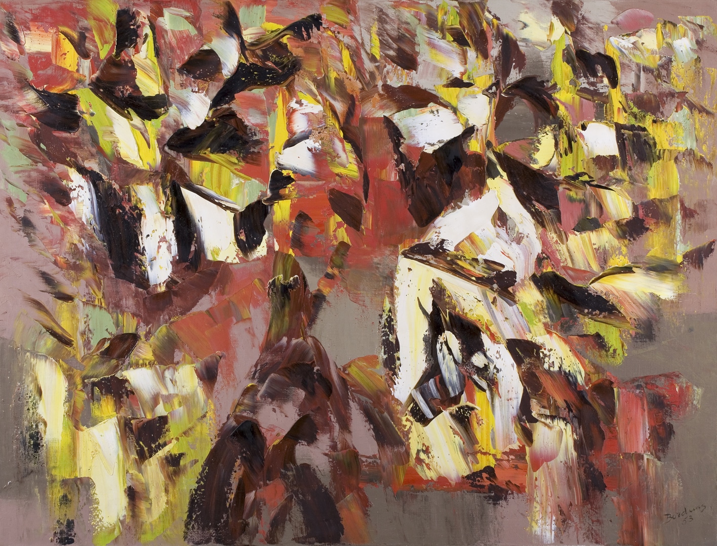
Paul-Émile Borduas, Figure aux oiseaux (Figure with Birds), 1953, oil on canvas. Gift of Ayala and Samuel Zacks, 1962 (05-020). Photo: Bernard Clark

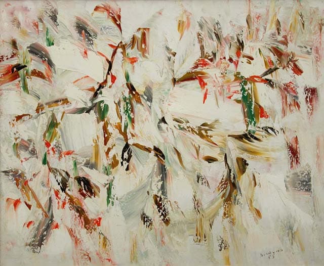
Paul-Émile Borduas, Souriante, 1955, oil on canvas. Gift of Ayala and Samuel Zacks, 1962 (05-021). Photo: Bernard Clark
Skirt: 1950s
In the 1950s, nonwoven synthetic fabrics were considered experimental, pushing ready-to-wear clothing to new heights as the fashion industry adopted products developed by paper and chemical companies. As fashion editor Paula Reed points out, “Wrinkle-resistant and durable synthetic fibres were embraced by a culture that equated crisp clothing and neat home furnishings with bourgeois respectability.” 22 Trademarked materials, such as Acrilan, Dacron, Dynel, Lurex and Pellon, were touted in fashion ads and catalogues as fantastic and new by virtue of their made-up names and easy-care features. This skirt was designed in the house of Jonathan Logan Inc., New York, a women’s apparel manufacturer known for its classy and dressy designs. Founded in the 1940s, Jonathan Logan (not a designer, but a made-up corporate moniker) became one of the largest ready-to-wear companies in North America. 23
The nonwoven fabric is the perfect “canvas” for the iconic 1950s circle skirt, which endured as popular fashion wear throughout the decade. Neither pleated nor gathered, a circle skirt’s swirl is derived from the fullness of the fabric, often cut from one piece, though in this case two seamed pieces. “In the height of fashion for the summer season,” announced Jet magazine in 1952, “will be yards and yards of material in charming billowy circular skirts. Unusual designs in the modern touch are carried out on pique in a rainbow of colors. The gay skirts are made to swing and sway.” 24 Crinolines and petticoats as undergarments sometimes added to the volume and rustle. At the same time clothing manufacturers began using Pellon, which was a nonwoven textile used as an inexpensive stiffener to create full-skirted designs. 25 Its crisp stiffness and flat surface quickly opened up design possibilities, allowing for vibrant graphic printing that drew inspiration from the art world, particularly abstraction, as evidenced in this particular skirt, which brings the interface-like material to the fore. Sometimes referred to as “paper skirts,” these early nonwoven fashions led to the 1960s fad for so-called disposable clothing, as representative of a modern on-the-go lifestyle.
AB
……..

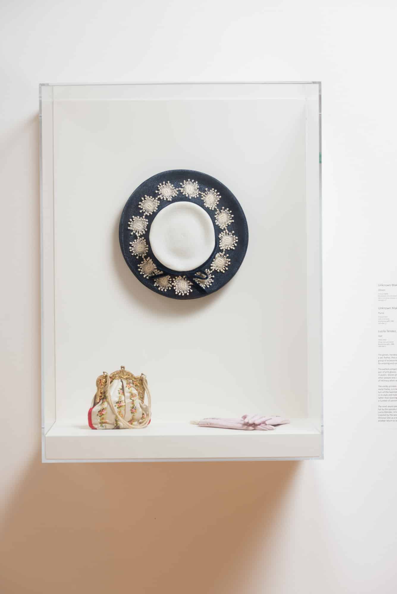
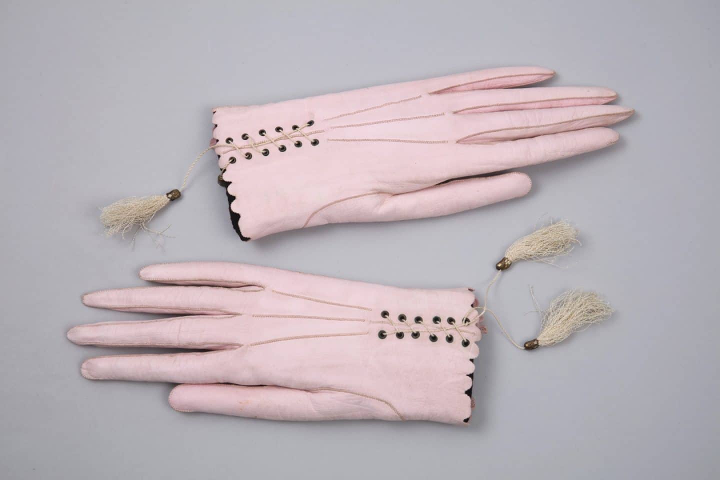
Top to bottom: Lucila Mendez, New York, Hat, 1955–1960, straw, lace and velvet. Anonymous gift, 1988 (C88-668.5); Unknown Maker, Purse, around 1903, satin and metal. Anonymous gift, 1961 (C61-548.17); Unknown Maker, Gloves, around 1860s, kid leather, silk and metal. Gift of Christian Gurney, 1993 (C93-001.07). Photo: Paul Litherland

Unknown Maker, Gloves, around 1860s, kid leather, silk and metal. Gift of Christian Gurney, 1993 (C93-001.07). Photo: Bernard Clark

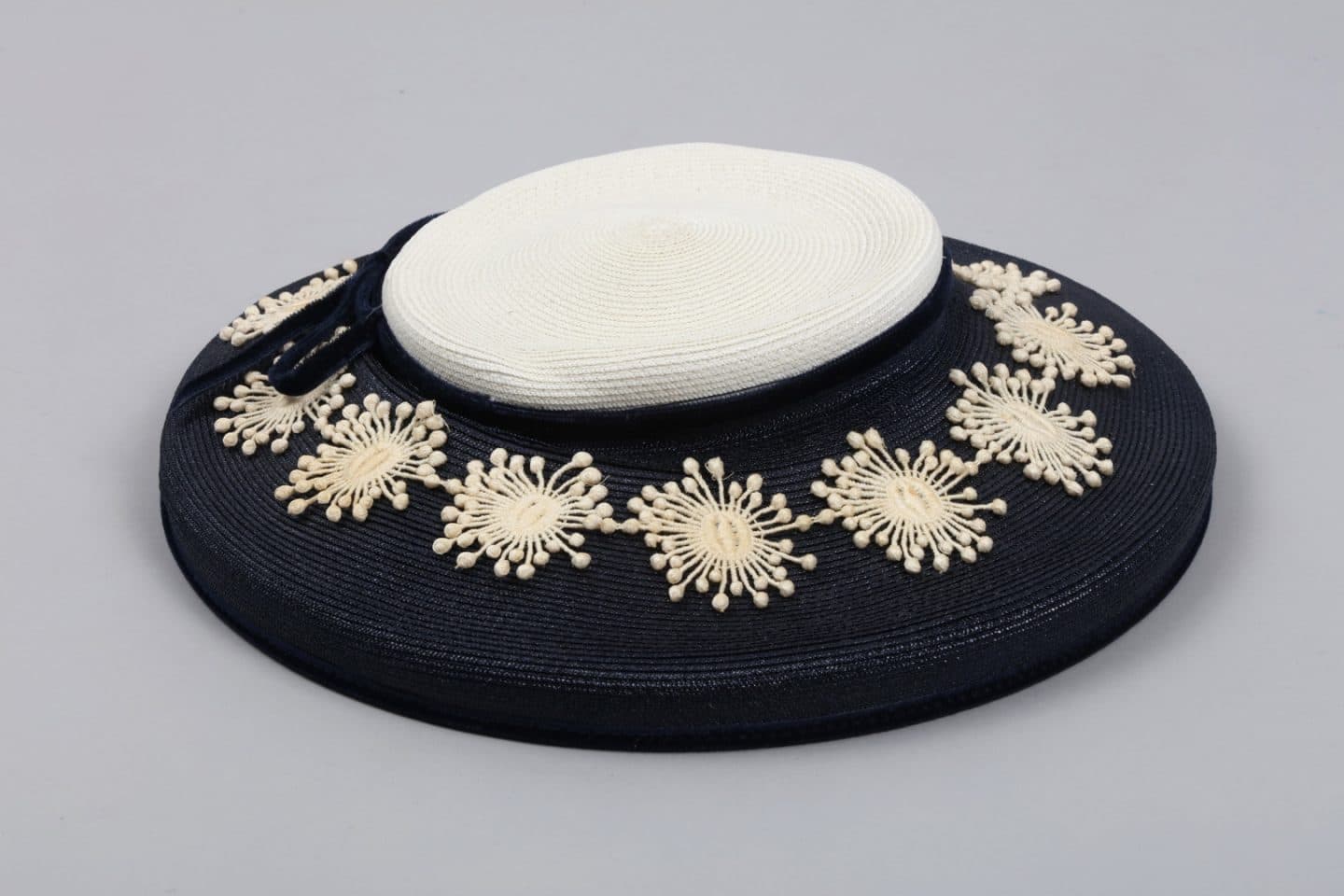
Lucila Mendez, New York, Hat, 1955–1960, straw, lace and velvet. Anonymous gift, 1988 (C88-668.5). Photo: Bernard Clark
Gloves, Purse and Hat: 1860s, 1900s and 1950s
Spanning a hundred years, the gloves, handbag and hat shown here are not a set in themselves. However, they do form a representative grouping of ubiquitous accessories that most women deemed necessary for entering and navigating the public sphere, whether visiting an art salon, exhibition or gallery. Their forms and styles changed over the decades but their purposes and presence did not.
The earliest components of the set are the diminutive and elegant gloves dating from the 1860s. They were as fashionable as they were functional. Made from thin kid-leather coloured a delicate shade of pink, with scallop-edged hand openings and decorative lacing ending with silk tassels, these accessories were made to be seen in public settings. But gloves also provided a barrier between oneself and outside surfaces and other people. Conversely, they facilitated demonstrations of intimacy when removed. The diminutive size of the gloves may suggest they were a child’s but the proportions, with their long and slender fingers, and sophisticated level of fashionability, counter such an assumption. That said, wearing gloves was common practice for girls, who were considered adult women in training, even if only informally until adolescence. As such, they likewise rarely ventured out into the public arena without gloves (plus hat and sometimes handbag).
The vividly printed silk handbag with its intricately molded metal frame dates from around the turn of the twentieth century and is in keeping with the elaborate and sumptuous ambience of that time, known as the belle époque. Luxurious in its style and materials, the purse’s size points to evening rather than daytime use, while still being capacious enough to hold a change purse, handkerchief, keys or various other small personal items. Handbags represented a private world of small possessions with potentially highly significant and individual meanings. They were intimate, personal objects that women carried with them. Alone of the three, handbags and purses remain in common usage, continuing to be perceived as indispensable articles in women’s daily lives today.
The latest piece of the grouping is a black-and-white straw hat from the 1950s by mid-century upscale New York milliner Lucila Mendez. Another highly fashionable daywear piece, it is directly inspired by the overall aesthetic of the “New Look.” This was introduced to women’s fashion by Christian Dior in 1947 as a reaction against war-time austerity and utility of the preceding several years by a return to exaggerated femininity. 26 The Mendez hat showcases this look through its use of white floral-like appliques ringing the black brim. Hats performed dual functions of “finishing off” an ensemble while also potentially providing shade and/or the ability to conceal one’s countenance with a practiced angling of the head.
CD
……..

El Jamon (Lily Jamon), left to right: Hat, 1960–1970, felt and silk; Hat, 1960–1970, cotton; Hat, 1960–1968, felt, silk and net. Gift of Natasha Jamon Qua, 1995 (C95-001.01, C95-001.02, C95-001.04). Worn by Elizabeth L. Gordon. Photo: Paul Litherland

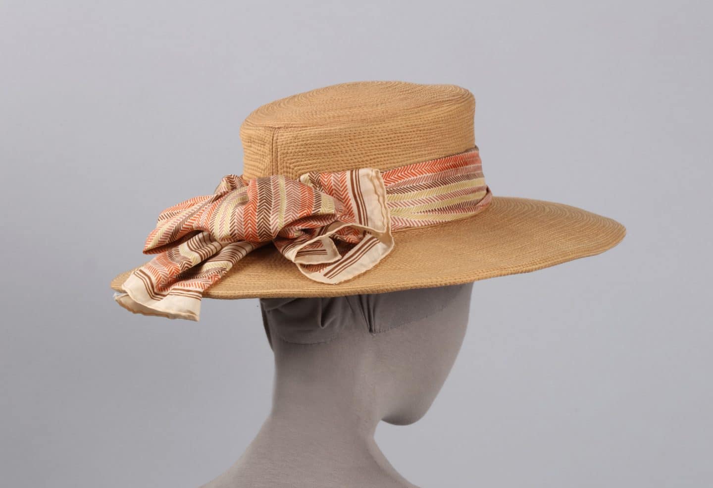
El Jamon (Lily Jamon), Hat, 1960–1968, felt, silk and net. Gift of Natasha Jamon Qua, 1995 (C95-001.04). Worn by Elizabeth L. Gordon. Photo: Bernard Clark

El Jamon (Lily Jamon), Hat (detail of label), 1960–1968, felt, silk and net. Gift of Natasha Jamon Qua, 1995 (C95-001.04). Worn by Elizabeth L. Gordon. Photo: Bernard Clark

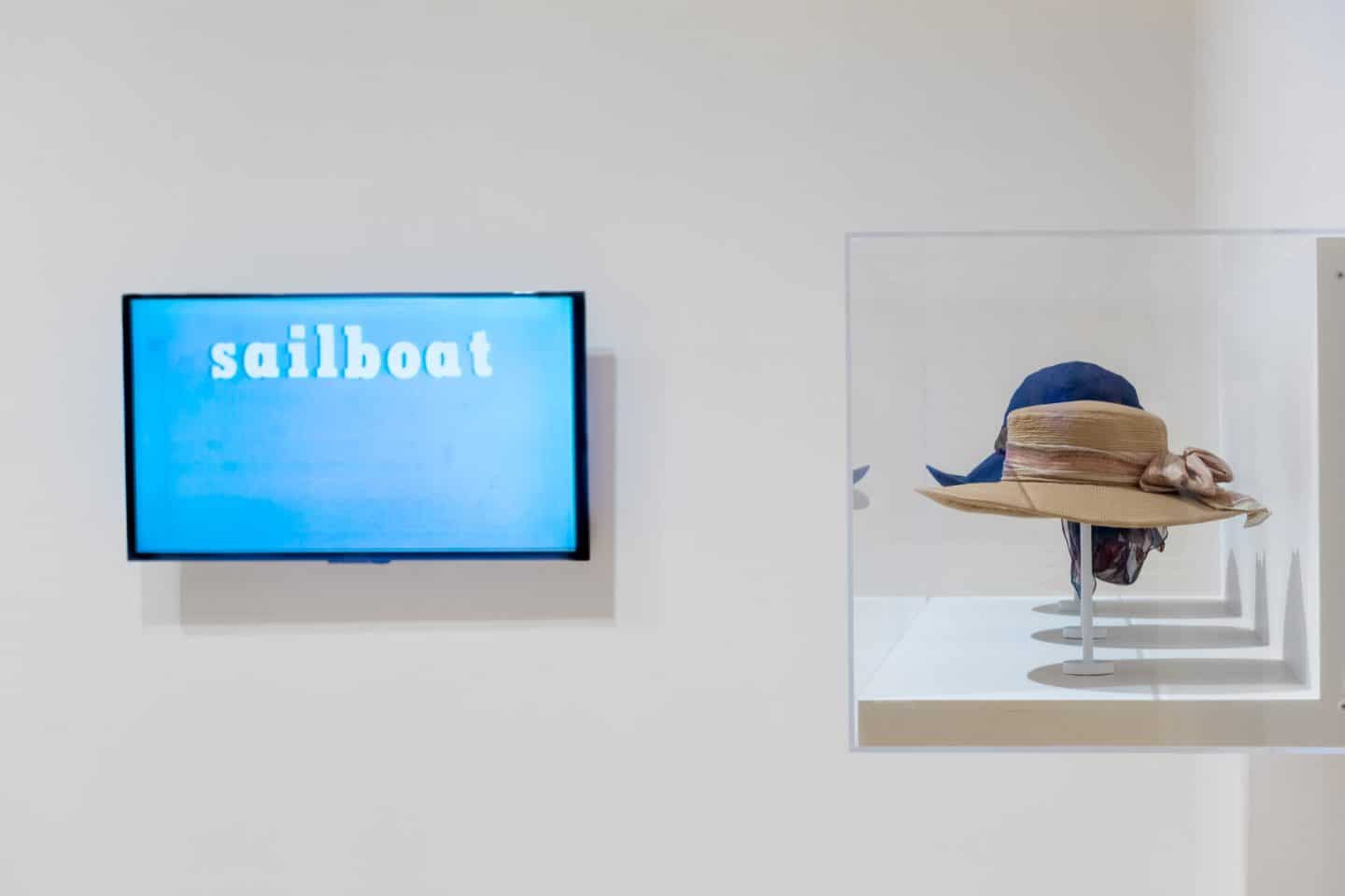
Joyce Wieland, Sailboat, 1967–1968, video. Purchase, 2001 (44-002). Photo: Paul Litherland
Hats: 1960s
Toronto milliner Lily Jamon (1918–2009), known as El Jamon (fig. 11), and philanthropist Elizabeth Gordon, were a fine match. Gordon, affectionately called “The Hat Lady” by many colleagues and friends, commanded instant attention when she entered a room wearing a dramatic El Jamon hat. Gordon was co-founder of the Gordon Foundation—formally established in 1965—along with her husband Walter L. Gordon and his brother Duncan Gordon. While the Foundation contributed widely to healthcare, peacekeeping, education and the environment, art was Gordon’s passion. 27 At both the Art Gallery of Ontario in her home city Toronto and in other galleries province-wide, she worked through the Foundation to build collections and foster knowledge of art and artists. In particular, she championed women artists who, even more than their male counterparts, struggled to earn recognition and a living through their art. The Gordons considered Lily Jamon one of these artists. As Walter Gordon wrote to Jamon in 1982, when purchasing a hat as a Christmas gift for his wife, “I do not think you charge enough for your works of art.” 28

FIG. 11 In this 1950 portrait of Lily Jamon, by Toronto photographer Paul Rockett, she wears one of her conical hats, a design that was ahead of its time.
Jamon arrived in Toronto in 1942 from Winnipeg where she’d worked as a fabric cutter and quality controller for the clothing manufacturer S. Stall and Sons. One of ten children born to Anastasia and John Jaman in the Ukrainian farm community of Sirko, southeast of Winnipeg, she left home early, seeking a new life. 29 In Toronto, she found work as a darkroom technician and stylist with the photography studio, Pringle and Booth. When the photographer, Ken Bell, needed a hat for a model and none was available, Jamon twisted two gloves together and thus, so the story goes, launched her millinery career. From the late 1940s, with no formal training, she established herself in Toronto’s Annex as a prominent couture milliner. Her distinctive sense of colour and design, her capacity for hard work and her ongoing passion to learn assured her success. In 1953, Tom Patterson, founder and artistic director of the Stratford Festival, invited Jamon to become the Festival’s first milliner. There, for more than a decade, she worked closely with designers such as Tanya Moiseiwitsch. 30 Jamon’s career in Toronto continued into the early 1980s.
These three El Jamon hats made for Gordon show the designer’s (and, in turn, the wearer’s) fondness for bold shapes, striking colours and distinctive trim. Jamon’s styles were as diverse as her more than 700 clients, drawn from Toronto’s academic, arts and business communities. 31 The construction of the first hat displayed here, a simple large-brimmed design made of molded felt, is distinguished by its two-toned moiré ribbon trim. The second hat, bold violet in colour and finely stitched in concentric circles, with multicoloured scarf and a divided brim at the back, was one of Jamon’s favourite styles. The stitching gave the hat flexibility and durability, which made it ideal for travel. Other clients, such as Brenda Davies, wife of author Robertson Davies, favoured these designs. The third hat, named a “Market Hat” by Jamon, intended for wearing on daily rounds, shows a more structured application of the concentric stitching she often used.
Many El Jamon hats are now in Canadian museums, 32 while others still remain in private collections, such as in the Gordon family, where they’ve been passed down from mothers to daughters, proof of their symbolic power to transmit female lineage, confidence and indomitable style.
DM
……..

Stepping Out: Clothes for a Gallery Goer, installation view, 2019. Photo: Paul Litherland

Elsie (Creech) Densem, left to right: Dress, 1965–1969, silk, cotton/polyester and metal, Dress, 1965–1969, rayon and cotton/polyester. Gift of Martin and Judith Hunter, 2008 (C08-001.08 and C08-001.10). Worn by Judith Hunter. Photo: Paul Litherland

Elsie (Creech) Densem, Dress (detail), 1965–1969, rayon and cotton/polyester. Gift of Martin and Judith Hunter, 2008 (C08-001.10). Worn by Judith Hunter. Photo: Bernard Clark

Elsie (Creech) Densem, Dress, late 1970s–early 1980s, silk and polyester. Gift of Martin and Judith Hunter, 2008 (C08-001.18). Worn by Judith Hunter. Photo: Bernard Clark

Kosso Eloul, Eternal Flame, 1974, aluminum, series of 100. Gift of Mrs Ruth Soloway, 2012 (55-004.51). Photo: Bernard Clark

Charles Jourdan, Paris, Shoes, 1970s, leather. Gift of Elizabeth Walker, 2003 (C03-001.10). Photo: Bernard Clark
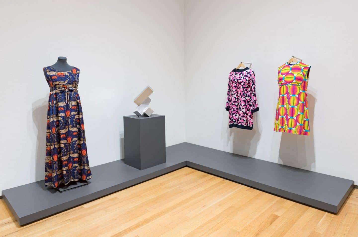
Dresses: 1960s and 1970s
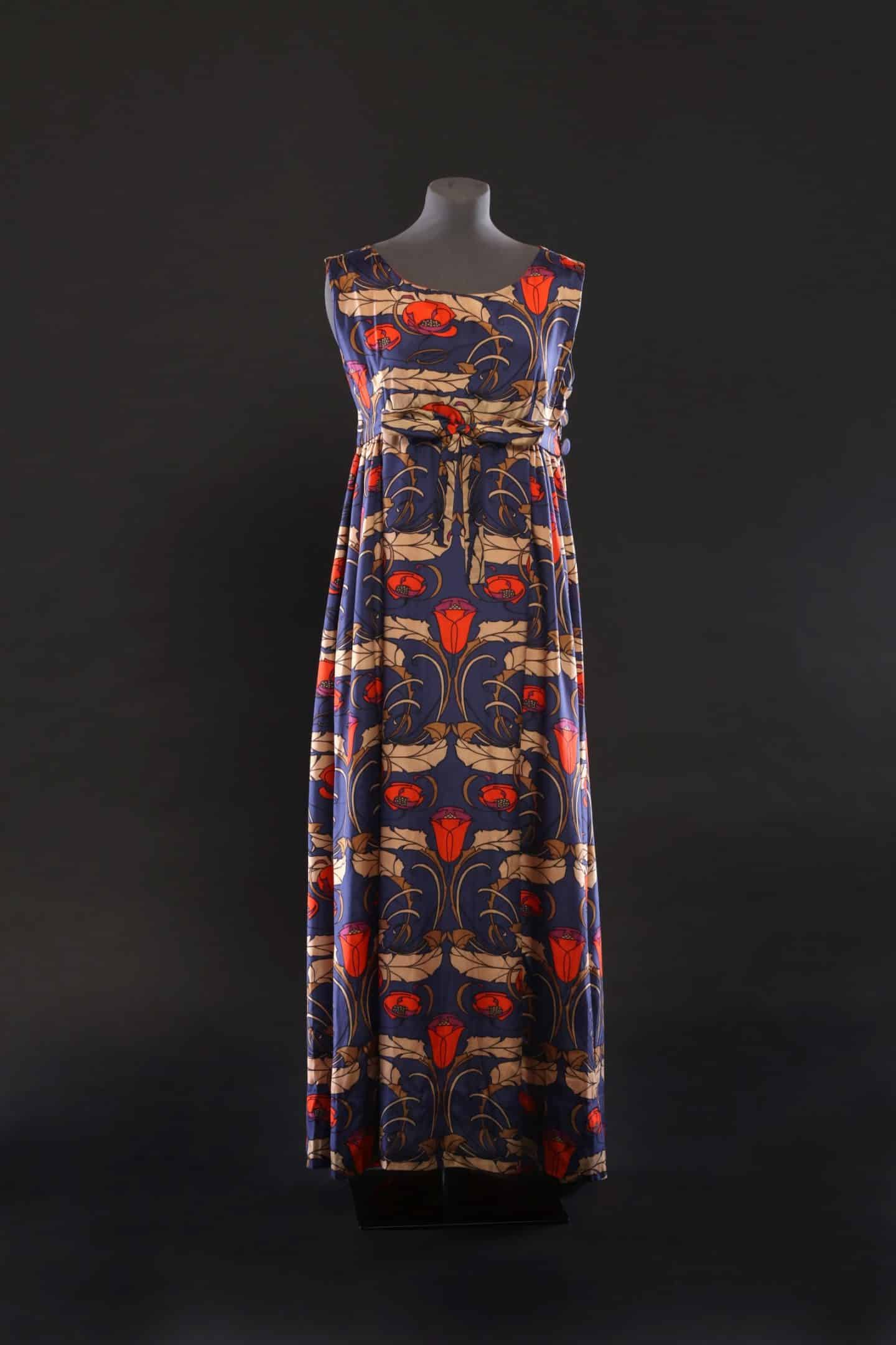
Former Amherst Island resident, Elsie Densem (1907–2007), fashioned this trio of dresses for her long-time client and friend Judith Hunter. The two mini dresses were made in the 1960s and the full-length dress in the late 1970s or early 1980s, shortly before Densem ceased dressmaking. These dresses, along with others in the collection created by Densem, are characterized by fabrics with striking prints and designs, typically supplied by her clients, which she skillfully manipulated into deceptively simple designs so as to highlight the textiles’ visual interest. These three examples clearly demonstrate how Densem pursued dressmaking “for the love of it and for people whom she liked and who had an adventurous clothes sense.” 33
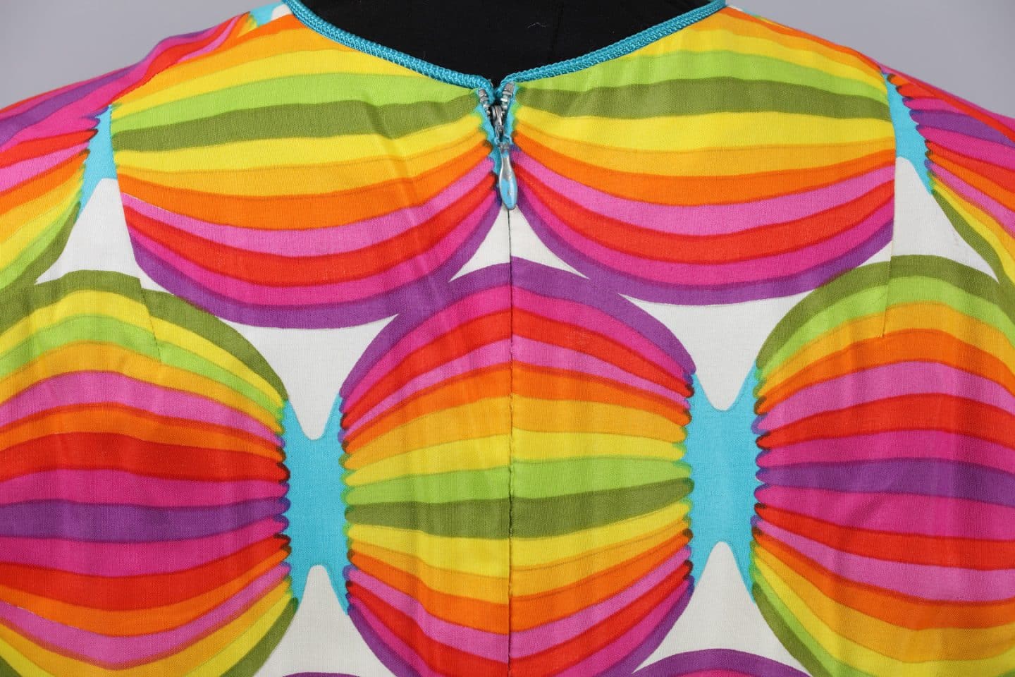
The mini dresses are quintessential examples of 1960s “mod” fashion, with their short lengths and A-line shift dress silhouettes. Both dresses display bright prints directly influenced by the highly graphic “Pop” and “Op” art movements of the time. The cotton dress printed with rainbow-hued circles evokes Yves Saint Laurent’s 1965 “Mondrian Collection” inspired by the canvases of Piet Mondrian or Campbell’s Soups 1966–1967 promotional mini dresses (the “Souper” dress) printed with Andy Warhol’s repeating Campbell’s soup can motif. 34 Similarly, this dress resembles a work on canvas directly reproduced onto a garment, demonstrating the potentially porous boundary between fine art and fashion. Artwork is made dynamic by being brought out of the gallery or museum space and relocated onto the body to move through everyday life. These silhouettes and modernist prints, in conjunction with the social revolution of the 1960s, harken back to and were inspired by similar developments in 1920s fashion and society, surprisingly tapping into the energy of a past era to look toward the future.
The later, longer dress also reflects an art movement, yet in a different manner to the mini dresses. The printed silk used to make this dress is equally striking and graphic as that of the earlier dresses, however its Art Nouveau-style printed design was already antique and historical by the time the dress was created. Instead of reflecting up-to-the-minute modernity, this dress harkens back to the turn of the twentieth century. Its printed design, even more than its silhouette, demonstrates the aesthetic shift that occurred between the 1960s and 1970s. While the 1960s looked toward a space-aged future, 1970s fashion looked back to a bucolic pastoralism centred on the late Victorian era, taking its cues from the period directly preceding Art Deco whose influence contributed to 1960s mod culture. The longer and slightly fuller skirt of this dress heightens the romantic sensibility.
In both instances, these dresses provide examples of ways in which women could literally wear art. As such, they were particularly apt for their wearer, Judith Hunter, who was a keen advocate of the arts and arts education. Each of these three dresses speaks to the direct dissemination of art through fashion and experiences of everyday life. They are also telling examples of fashion’s cyclical nature, summed up by the adage “everything old is new again.”
CD
……..

Stepping Out: Clothes for a Gallery Goer, installation view, 2019. Photo: Paul Litherland

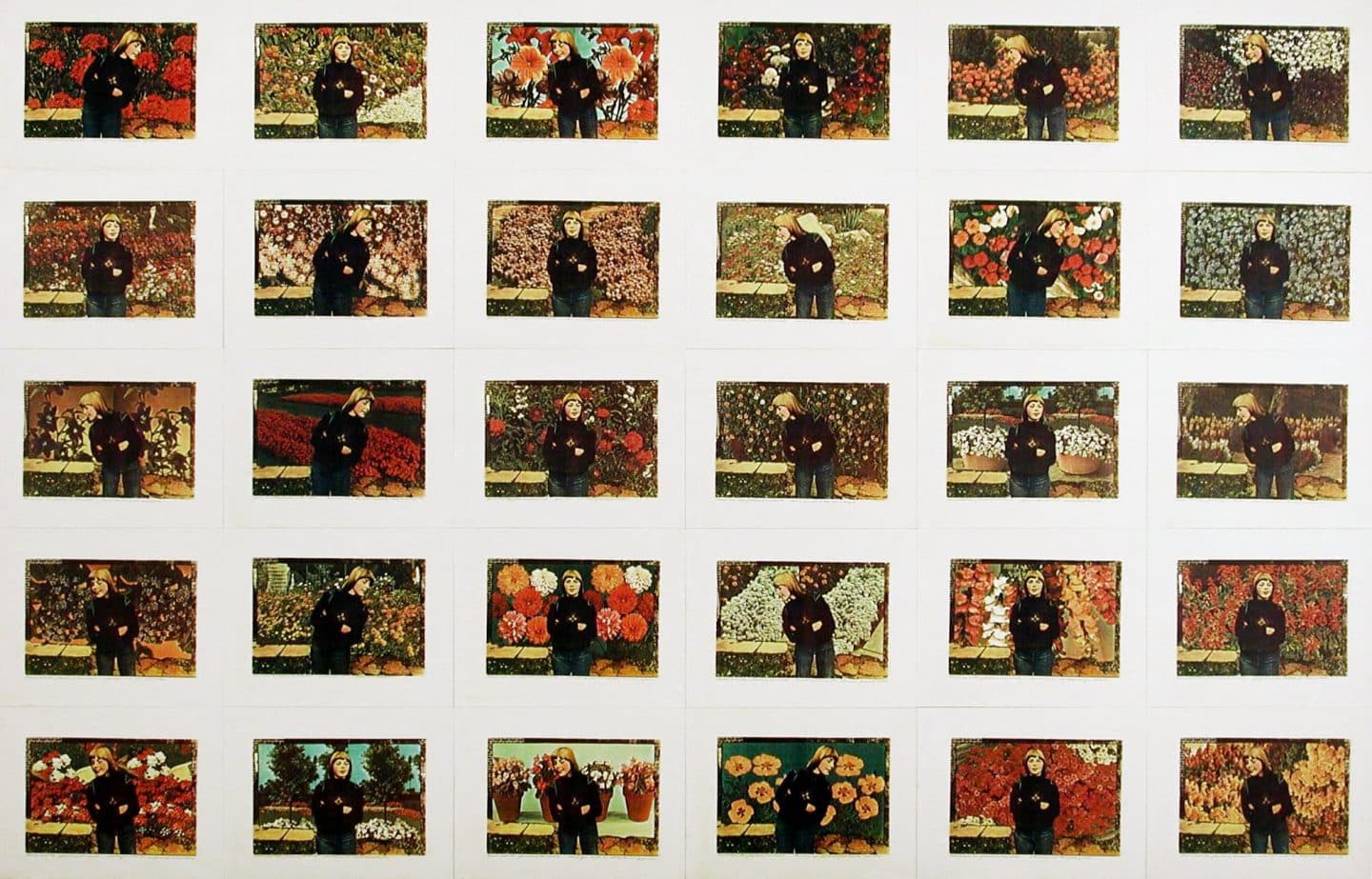
Barbara Astman, Connie and the Flowering Annuals, 1977, colour Xerox print on paper. Purchase, Canada Council and Gallery Association Matching Grant, 1977 (20-085) Photo: Agnes Etherington Art Centre

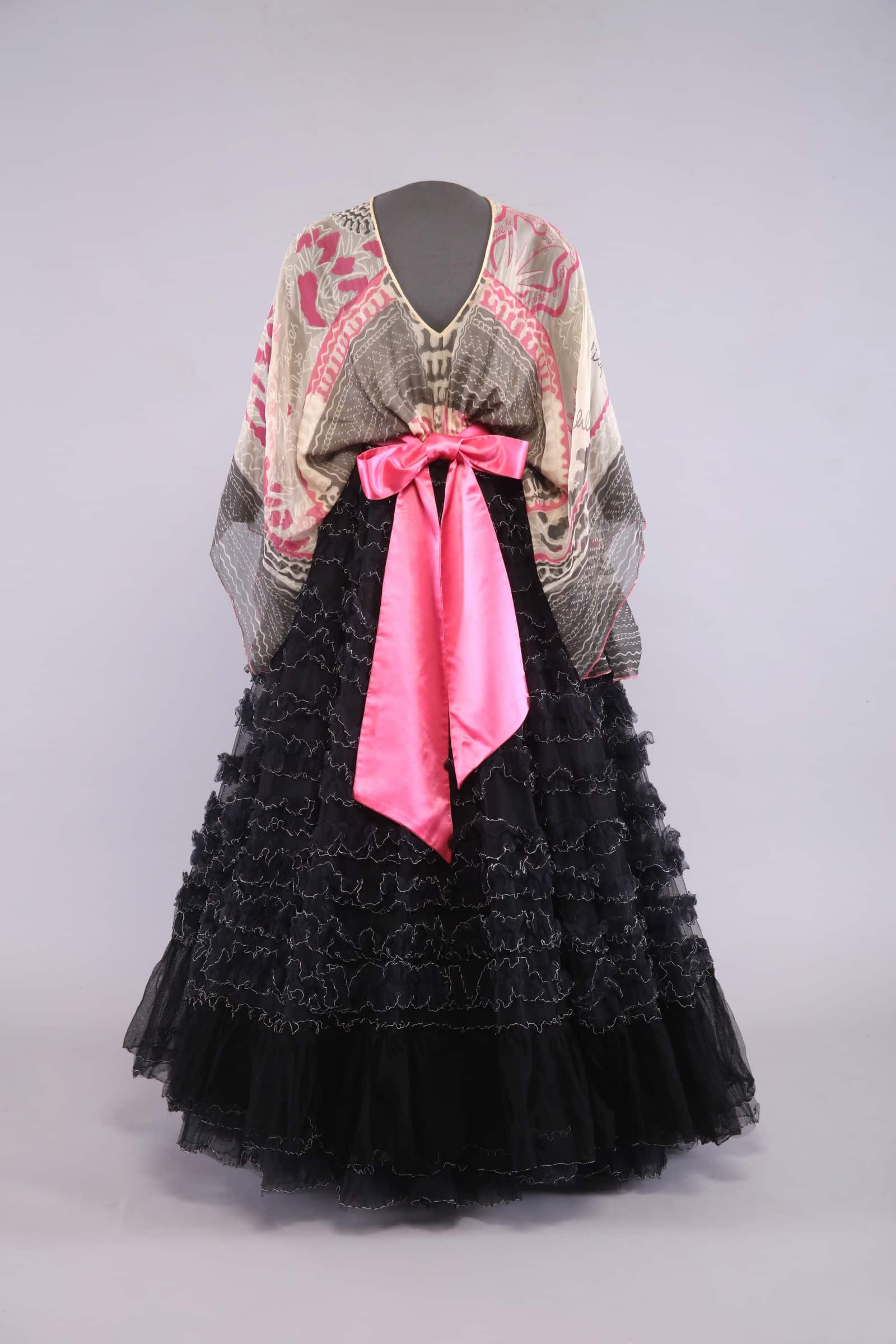
Zandra Rhodes, Dress, 1973–1976, silk and nylon. Gift of Sylvia Gillespie-Keyl, 1999 (C99-001.01a-f). Worn by Sylvia Gillespie-Keyl to an opening at Covent Garden. Photo: Bernard Clark
Dress: 1970s
Zandra Rhodes appeared on the London fashion scene in the late 1960s along with a handful of British designers who embraced historical revival styles and non-Western clothing traditions of Bohemian dress. Hippies of the time enjoyed dressing-down in nonconformist fashion, but Rhodes’s clientele were part of a wealthy, dressing-up culture. 35 Her ultra-feminine dresses expressed her style with screen-printed references to the landscapes of Australia, the American West and Mexico, in fine silks and rows of ruffles.
Rhodes’s garments of this period were unconventional and would have been out of place at cocktail parties or in formal ballrooms. They were designed for bold clients searching for unique pieces to wear at artistic events, such as gallery openings and theatrical productions. 36 These colourful, hand-painted gowns—and the clients wearing her gowns—heightened the spirit of the event with a demonstration of art that extended beyond stage and gallery walls. This particular dress was worn to an opening at Covent Garden, by Canadian actress Sylvia Gillespie-Kyle, who later, as a Kingston resident, donated it to the Agnes Etherington Art Centre.
Rhodes’s fashion design process follows the ancient method of pattern development, in which a garment’s silhouette is determined by width and drape of the fabric rather than conventionally drafted patterns. This simple T-shape bodice with kimono sleeves provides a wide canvas for screen printing without the intrusion of shaping seams or darts. A theme of pink and ivory lilies and cursive text is randomly repeated across the bodice with a banner on one shoulder containing the words “I love a beautiful lily.” A wide border of scribbled script pinstripes mimics designs from Rhodes’s 1973 “Field of Lilies” gown. 37 Fine silk floats around the body, giving the bodice an undefined shape. She marries this fluidity of silk with a structured overskirt of black nylon tulle ruffles, stiffened with a crinoline. Rows of gathered tulle edged in white repeat and reinforce the scribbled script motif. A large romantic satin bow at the waist and simple tie closure at the neck finishes the design.
Rhodes has always seen her fashions as works of art. She studied textile design at Medway College in Kent, United Kingdom, and won a scholarship at the Royal College of Art from which she graduated in 1964. “I was proud to be a textile designer,” she writes, “and I did not feel inferior to a painter or sculptor; it was my métier.” 38
EM
……..

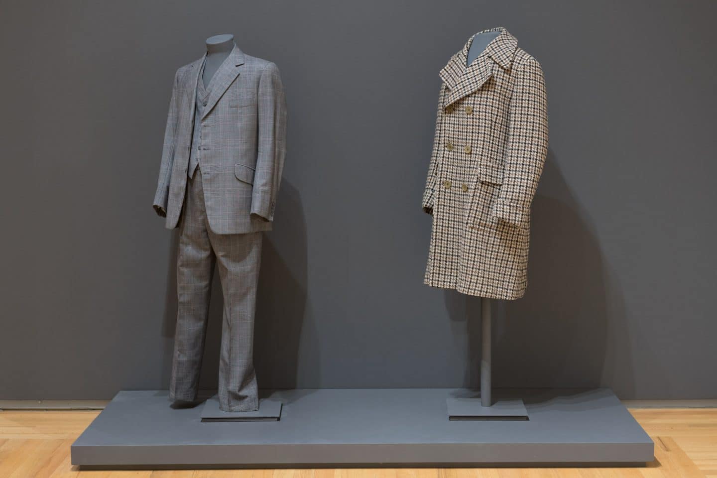
Left to right: Hicks and Sons, London, Suit, 1975, wool. Gift of Alastair Walker, 1991 (C91-731.01). Worn by Alastair Walker; Aquascutum, England, Coat, around 1976, wool. Gift of Mary Stewart, 2003 (C03-002.21). Worn by J. Douglas Stewart. Photo: Paul Litherland
Coat and Suit: 1970s
These two garments are examples of 1970s British menswear—one ready-to-wear, the other tailored—that recall traditional design. The clothing manufacturer Aquascutum first introduced “Heritage Check” in 1976, here incorporated into a six-button, double-breasted tweed coat, which emulates the nineteenth-century overcoat. Buttons are a gauge of formality, and four of them appear on each sleeve of the Hicks and Sons three-piece tweed sporting suit. While a less useful feature in the 1970s, the fact that the two lower cuff buttons are functional was a sign of the maker’s craft, and a point of pride for the 9 Savile Row establishment. On the London street famed for bespoke tailoring, the same address would later become the site of Alexander McQueen’s first menswear store. Other interior details of the suit further signal fine workmanship, such as the lapped trouser leg seams and taped heels to guard against wear, the inner ticket pocket in the jacket’s right-side slant pocket, and the boutonnière buttonhole on the left lapel, with the (now lost) silk twist underneath to hold a flower stem.
While the casual leisure suit in rainbow colours and synthetic materials found traction in the 1970s, there was also a return to a classic cut and fabric, or rather a tenacious hold to sartorial tradition, as hand-tailoring became an increasingly rare profession. The waistcoat re-emerged, as did wider lapels (after the slim 1950s and 1960s). The three-piece suit found itself indulging in the “disco era,” and crossing gender lines as women adopted menswear (think Annie Hall). As fashion historians have pointed out, “with the move of established designers (such as Calvin Klein, Pierre Cardin, Yves Saint Laurent, Perry Ellis, Christian Dior, and others) from womenswear to menswear beginning in the late 1970s the menswear consumer began to become more fashion conscious” and there was “a move back toward a ‘traditional look’ … amongst men who followed fashion,” fed by these designers whose creations embodied earlier styles.39 Both the coat and suit are evidence of this consciousness, and were worn by aesthetically-minded Queen’s University professors, who were closely involved with the work of the Agnes Etherington Art Centre during this period.
AB
_____
Endnotes
2 Jennifer Poulain, Conservation Science Division, “Analysis of a Coating on a Dust Jacket for Agnes Etherington Art Centre, Kingston, Ontario Canada,” Canadian Conservation Institute, Report No. CSD 5413, CCI 129866, 6 April 2017.
3 Christina Walkley and Vanda Foster,
Crinolines and Crimping Irons. Victorian Clothes: How They Were Cleaned and Cared For (London: Peter Owen, 1978), 37; Albert A. Hopkins, ed.,
The Scientific American Cyclopedia of Receipts, Notes and Queries, 25th edition (New York: Munn and Co., 1906).
4 Michel Pastoureau,
Black: The History of a Color (Princeton: Princeton University Press, 2008), 274.
5 M. Elaine MacKay,
Beyond the Silhouette: Fashion and the Women of Historic Kingston (Kingston: Agnes Etherington Art Centre, 2007), 64–66.
6 Carole Turbin, “Fashioning the American Man: The Arrow Collar Man 1907–1931,”
Gender & History 14, no. 3 (November 2002): 478.
7 Michael J. Murphy, “Orthopedic Manhood: Detachable Shirt Collars and the Reconstruction of the White Male Body in America, ca. 1880–1910,”
Dress 32 (2005): 80.
8 Brent Shannon,
The Cut of His Coat: Men, Dress, and Consumer Culture in Britain 1860–1914 (Athens: Ohio University Press, 2006), 139; Murphy, “Orthophedic Manhood,” 80.
9 Cole Porter,
Anything Goes, 1934.
11 See, as examples,
Brandon Daily Sun, 6 December 1926;
Vancouver Daily World, DAY December 1920;
Ottawa Journal, 29 April 1920; and
Lethbridge Herald, 25 June 1922.
17 James Laver,
Costume and Fashion: A Concise History, 5th ed. (London: Thames & Hudson, 2012), 232–233.
18 “A Ruffled State of Mind,”
McCall’s (October 1933): 99.
19 Originally made as a wedding dress, it was likely worn beyond the special day, like many during this period, reflecting the economy and resourcefulness of Depression-era fashion.
20 For the objects’ individual histories, I am grateful to their respective donors.
21 On the topic of crazy quilts and the incorporation of souvenir ribbons, see Jennifer Gilbert,
The New England Quilt Museum Quilts (Concord, CA: C&T Publishing Inc, 1999), 44–48.
22 Paula Reed,
Fifty Fashion Looks that Changed the 1950s (London: Design Museum Enterprise Limited, 2012), 64.
25 Jonathan Walford,
1950s American Fashion (Botley, Oxford UK: Shire Publications, 2012), 8.
26 James Laver,
Costume and Fashion: A Concise History, 5th ed. (London: Thames & Hudson, 2012), 256.
27 For a history of the Gordon Foundation, see Charles Foran,
The Gordons: Portraits in Philanthropy (The Gordon Foundation, 2015),
gordonfoundation.ca.
28 Walter L. Gordon to Lily Jamon, 20 December 1982, collection of Natasha Jamon Qua.
29 After moving to Toronto, Jamon changed the second “a” in her name to “o.”
30 The simple red cap that Jamon made for Alec Guinness in the Festival’s 1953 inaugural production of
Richard III is preserved in the Festival Archives. Other examples of Jamon’s Festival millinery can be seen in the theatre drawings of Grant Macdonald at the Agnes Etherington Art Centre.
31 Lily Jamon, Client List, collection of Natasha Jamon Qua.
32 In addition to the El Jamon hats made for Elizabeth Gordon in the Agnes Etherington Art Centre collection (five in total), the Costume Museum of Canada (Winnipeg) holds fourteen, and the McCord Museum (Montreal) holds seven. The Royal Ontario Museum has twenty-seven hats made for interior designer Frances Boorer, including the iconic City Hall Hat that she wore to the opening of Toronto’s New City Hall in 1965. The Fashion History Museum (Cambridge, Ontario) holds two El Jamon hats and Toronto’s Museum and Heritage Services holds one. The earliest hat discovered thus far, with a handwritten label, is held by the Mobile Millinery Museum (Burlington, Ontario).
33 Undated document, Hunter donor file, Agnes Etherington Art Centre, Queen’s University.
34 For reference to Yves Saint Laurent’s “Mondrian” dress, see James Laver,
Costume and Fashion: A Concise History, 5th ed. (London: Thames & Hudson, 2012), 265–266. For reference to the “Souper” dress, see Kathleen Paton, “Paper Dresses,” in Valerie Steele,
Encyclopedia of Clothing and Fashion, vol.3 (Farmington Hills, MI: Thomson Gale, 2005), 15–16.
35 Tony Glenville and Amy de la Haye, “Bohemian,” in
The Cutting Edge: 50 Years of British Fashion 1947–1997, ed. Amy de la Haye (London: V&A Publications, 1997), 95.
37 The Costume Institute at the Metropolitan Museum of Art, which owns a look-a-like gown, dates this dress to Rhodes’s 1975–1976 collection; however, as Rhodes is not bound by the confines of seasonal styles, the dress borrows elements from earlier collections. See, for example, Zandra Rhodes Style Bibles, Catalogue of Possessions, 33, illustration number 73/23, and Style Bible 3, 74, illustration number 73/44. University for the Creative Arts, Prod. Turning the Pages,
http://uca.onlineculture.co.uk/zandra_rhodes/. The Zandra Rhodes Digital Study Collection is an extensive online source of drawings, inspiration, design and production techniques, which Rhodes uses to make her couture fashion. It includes a series of sketchbooks ranging from 1969 to 2012, which are filled with textile designs and renderings for garments; each coded with the year and running number sequence.
38 Quoted in Marie-Therese Gramstadt, “Zandra Rhodes’ ‘Works of Art’ (1979–1988): From Feminine Frills to Goddess Saris,”
Costume 50, no. 2 (2016): 246. See also “Discover Zandra Rhodes’ Exclusive archive II Collection,” 26 July 2017,
MATCHESFASHION.COM,
https://www.youtube.com/watch?v=Yte6JIq3IRY. In this short video Rhodes describes her designs as “a living work of art” that “go on living and have a life of their own.”
39 Veronica Manlow,
Designing Clothes: Culture and Organization of the Fashion Industry, (New Brunswick, NJ and London: Transaction Publishers, 2009), 69. See also Jeannette Jarnow and Miriam Guerreiro,
Inside the Fashion Business: Text and Readings, 5th edition (New York: Macmillan Publishing Company, 1991, 224, and James Laver,
Costume and Fashion: A Concise History, 5th ed. (London: Thames & Hudson, 2012), 276.
Biographies
Alicia Boutilier is Chief Curator/Curator of Canadian Historical Art at the Agnes Etherington Art Centre. She has produced numerous exhibitions, for the Agnes and art museums across Canada, on Canadian historical art and visual culture, with emphasis on women artists, artistic groups, regional scenes, collecting histories and intersections of art and craft. Among her curated and co-curated exhibition and publication projects are Road Trip: Across Canada with Alan C. Collier (2017); The Artist Herself: Self-Portraits by Canadian Historical Women Artists (2015); A Vital Force: The Canadian Group of Painters (2013); William Brymner: Artist, Teacher, Colleague (2010); Inspirational: The Collection of H. S. Southam (2009); Public Pictures/Private Homes: London’s Lending Library of Canadian Art (2007); An Intimate Circle: The F. B. Housser Memorial Collection (2005); and 4 Women Who Painted in the 1930s and 1940s (1998).
Carolyn Dowdell PhD, is an early-career academic dress historian and museum professional. Her current area of specialization is eighteenth-century women’s clothing construction examined from social history and material culture perspectives. She is also keenly interested the construction and social meanings of dress through the twentieth century. Dowdell’s past works include an exhibition of selected pieces displayed in the Agnes Etherington Art Centre from the wardrobe of Agnes Etherington entitled Artful Dressing: The Fashions of Agnes Etherington in 2014.
Deirdre Macdonald is a freelance writer, now living in Cape Breton, who spent her formative years in Toronto. Her special interest is the visual arts. She holds an Honours BA in English and a BEd from the University of Toronto, as well as an MA in English from York University. She has lived and worked in England and Kenya, and taught high school English in Toronto. Macdonald graduated in 2015 from the MFA program in Creative Nonfiction, School of Journalism, University of King’s College, Halifax, Nova Scotia, a member of its first graduating class. She is currently working on a book about Toronto milliner Lily Jamon.
M. Elaine MacKay recipient of the 2015 Isabel Bader Fellowship in Textile Conservation and Research, trained as a tailor and pattern maker, and specializes in the study of historical dress. MacKay has written about nineteenth-century women’s dress in Victorian Ontario; Basque Whalers’ clothing in sixteenth-century Labrador; the 1673 wedding suit of King James II of England; and the functional dress of early British climbers on Mount Everest. She has closely analyzed textile artifacts in the Queen’s University Collection of Canadian Dress; the Victoria and Albert Museum, London, UK; and Black Creek Pioneer Village, Toronto, Ontario. MacKay currently teaches at the Fountain School of Performing Arts at Dalhousie University and NSCAD University in Halifax, Nova Scotia. She continues to work as a Cutter and Special Skills Costumer in both theatre and film productions across Canada.
Sophia Zweifel is an objects and textiles conservator currently based in Calgary. She obtained her MA in Art Conservation from Queen’s University in 2015, and holds a BA and MA in Art History from the University of British Columbia and University College London, respectively. Zweifel has performed internships, fellowships and contract work at the Canadian Conservation Institute in Ottawa, the McCord Museum in Montreal, and the Canadian Museum of History in Gatineau. During the winter of 2017, Zweifel was in residence at the Agnes Etherington Art Centre and Art Conservation Program, Queen’s University, as the Isabel Bader Fellow in Textile Conservation and Research. She was Assistant Conservator with Conservation Solutions in Ottawa from 2017 to 2018. She is now the Contract Conservator for the City of Calgary Public Art Program.
_____
Figure References & Credits
FIG. 1 Eaton’s Fall and Winter 1897–1898, no. 39 (Toronto: T. Eaton Co, 1897). Library and Archives Canada (nlc-3949) © Sears Canada Inc. Reproduced with the permission of Sears Canada Inc., http://www.bac-lac.gc.ca/eng/discover/postal-heritage-philately/canadian-mail-order-catalogues/Pages/item.aspx?PageId=10595&
FIG. 2 Gennifer Majors, Isabel Bader Graduate Intern in Textile Conservation and Research, 2017
FIG. 3 Henderson, Kingston, Eliza Gordon, 1903–1904, Gift of the estate of Wilhelmina Gordon, 1968 (C68-590.17)
FIG. 4 “Fashion: Three French Models,” Vogue 40, no. 11 (1 December 1912). © 2012 Condé Nast
FIG. 5 “Arrow Collars” Ad, from The Literary Digest (21 February 1914), https://archive.org/details/literarydigest48newy/page/414
FIG. 6 “Arrow Collars & Shirts” ad, designed by Joseph Christian Leyendecker, from The Saturday Evening Post (11 October 1913). Courtesy of Rensselaer County Historical Society, Troy, New York
FIG. 7 “Holeproof Hosiery” ad, illustration by McClelland Barclay, from Photoplay 28, no. 1 (June 1925)
FIG. 8 Eaton’s Spring and Summer 1926 (Toronto: T. Eaton Co, 1926). Library and Archives Canada (nlc-3949) © Sears Canada Inc. Reproduced with the permission of Sears Canada Inc., http://www.bac-lac.gc.ca/eng/discover/postal-heritage-philately/canadian-mail-order-catalogues/Pages/item.aspx?PageId=7036&
FIG. 9 “Crescendo: Shoulders strike a high note by one means or another,” McCall pattern ad, in McCall’s (October 1933)
FIG. 10 Gift of Paul Fritz, Arts ’61, 2013 (DOCC13-003.01). Photo: Agnes Etherington Art Centre
FIG. 11 Paul Rockett, Lily Jamon, photograph, 1950, from “What Is Beauty?,” National Home Monthly 51, no. 12 (December 1950)
_____
Acknowledgements & Credits
Published on the occasion of the exhibition Stepping Out: Clothes for a Gallery Goer, presented at the Agnes Etherington Art Centre, Queen’s University, Kingston, 27 April–1 December 2019, with the generous support of Dr Isabel Bader, the Isabel and Alfred Bader Fund of Bader Philanthropies, the City of Kingston Arts Fund through the Kingston Arts Council, and the Janet Braide Memorial Fund and Celebrate Agnes Fund, Queen’s University.
Curator: Alicia Boutilier
Authors: Alicia Boutilier, Carolyn Dowdell, Deirdre Macdonald, M. Elaine MacKay, Sophia Zweifel
Copy Editor: Shannon Anderson
Publication Design: Kelsey Blackwell
Exhibition Design: Brenna Caldwell
Conservation: Marissa Monette and Sophia Zweifel
© Agnes Etherington Art Centre, 2019
ISBN: 978-1-55339-629-1


