Agnes Etherington Art Centre developed four vinyl stickers for fall 2019. The artworks were selected from the Agnes collection. Pick out your very own, in gallery, while supplies last. Learn more about each below.
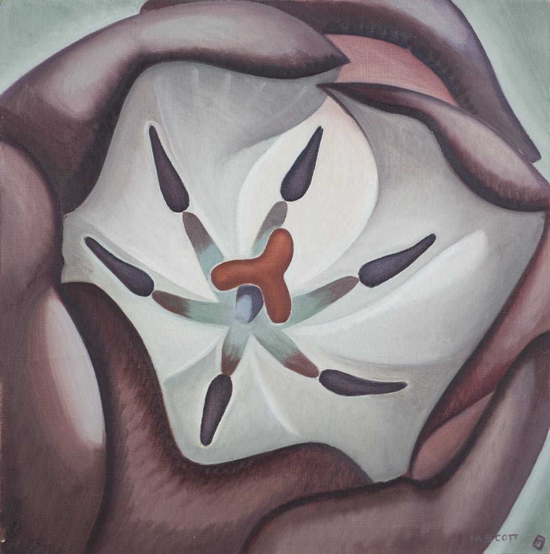
Marian Dale Scott, Tulip, around 1939, oil on linen. Purchase, Chancellor Richardson Memorial Fund and Donald Murray Shepherd Bequest Fund, 2012 (55-016)
Full-faced, up against the picture frame, Tulip pulsates with unfolding energy. In the 1930s, Montreal artist Marian Dale Scott turned to flowers and plants for subject matter, which launched, as her biographer Esther Trépanier points out, “a major phase of formal exploration.” This series was inspired by Georgia O’Keeffe, whom Scott called her artistic godmother. In these floral close-ups, Scott was fascinated by universal order in microcosm. She also believed that her “growing pictures” were fundamentally feminine. As she later described, “These are maternal pictures, pictures trying to express the wonder of growth.” Tulip contrasts with the urban images that the artist was painting in the same period. It has a life force that could split the concrete of her industrial scenes and cityscapes. In its structure, Tulip anticipates Scott’s 1940s paintings of embryos and atoms, delving deeper into the cellular world.
Marian Dale Scott studied at the Art Association of Montreal school, the Monument national and the École des Beaux-Arts before continuing abroad at the Slade School of Art, London. She was active in various Canadian artist societies newly established in the 1930s and 1940s: the Contemporary Arts Society, the Canadian Group of Painters, and the Federation of Canadian Artists. She also assisted Fritz Brandtner in running the Children’s Creative Art Centre, established by Norman Bethune. Socially engaged and successful in her thematic and formal explorations, Scott was one of the most daring modern Canadian artists of her day.

Marian Dale Scott, Tulip, around 1939, oil on linen. Purchase, Chancellor Richardson Memorial Fund and Donald Murray Shepherd Bequest Fund, 2012 (55-016)

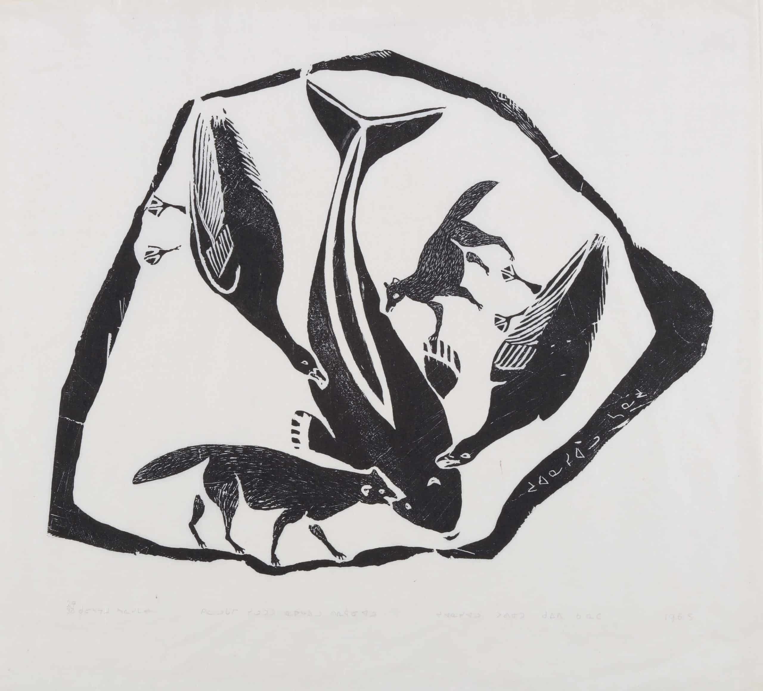
Juanisialu Irqumia, Fox and Seagulls Eating a White Whale/Beached White Whale is Rotted and the Foxes and Crows are Eating It, 1965, stonecut on paper, 29/30. Gift of Margaret McGowan, Arts ’78, 2017 (60-003.13)
Juanisialu Irqumia, Fox and Seagulls Eating a White Whale/Beached White Whale is Rotted and the Foxes and Crows are Eating It, 1965, stonecut on paper, 29/30. Gift of Margaret McGowan, Arts ’78, 2017 (60-003.13)
Printmaking flourished in many Inuit communities in the early 1960s, buoyed by a changing art world, Canadian nationalism, and reshaped attitudes towards Indigenous culture. Puvirnituq [Povungnetuk], in Nunavik [Arctic Quebec], was among the first communities to develop a print studio, when the artist Gordon Yearsley was hired by the co-operative to administer a print program. Yearsley focused upon the stone-cut relief and stencil technique. Artists such as Noah Quinuayark, Thomassiapik Sivuarapik, Leah Qumaluk, and others, created their first experimental prints in 1961. That same year, printmakers from Cape Dorset, which was the first Inuit community to begin printmaking, traveled to Puvirnituq to share their knowledge. Yearsley left due to differences with Father Andre Steinmann, the influential Catholic missionary. Vctor Tinkl was hired in 1962 to continue the print program. The Puvirnituq studio adopted the modern sosaku-hanga “self-printing” method, whereby the graphic artist cut his/her own block and printed the images, in contrast to the division of print labour that had emerged in Cape Dorset.
The Puvirnituq studio submitted its first prints to the Canadian Eskimo Arts Council advisory board in 1962. The community released its first annual collection in that year as a co-release with Cape Dorset (subsequent releases would be independent). The Puvirnituq co-operative built a studio facility in the community, and printmaking expanded, with exhibitions across Canada, the US and internationally. Puvirnituq prints are known for their direct, “unpolished” look, the frequent inclusion of text, and hunting, myth, and historical scenes. Printmaking began to decline in Puvirnituq in the 1980s. A fire gutted the studio, which effectively ended printmaking in Puvirnituq in 1989.
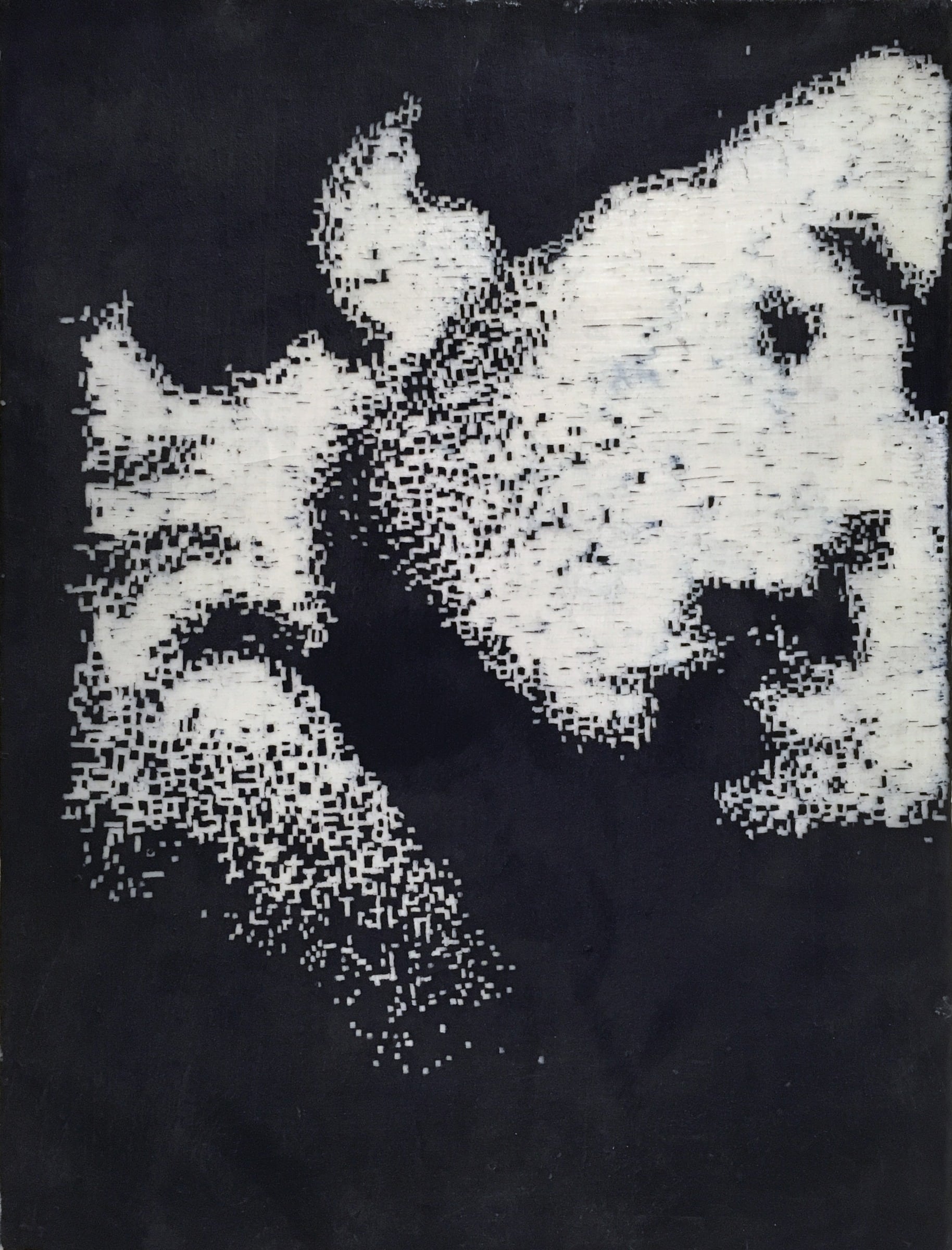
Stephen Andrews, Quick, 1992, encaustic, pigment and ink on canvas. Gift of Herbert O. Bunt, 1996 (39-052)
In the early 1990s, Stephen Andrews was working with re-reproduced and faxed images, a strategy of technical degradation he used to evoke forgetting, loss of resolve, the tenuous character of relation-ships and even, at a time when so many gay men were lost to AIDS, of life itself.
Quick is part of a series of images of kisses gleaned from porn magazines, life-affirming assertions of gay sensuality. The use of pigment and beeswax deepens the organic physicality of the painting. Andrews described his intentions in hand-copying digital images thus: “Previously I had worked figuratively, using line and shadow to evoke the emotional content of the image… What I’m trying to do now is effect the same emotional impact but with an even more pared-down line… hardly even a line, a pixel mark. With the pixel-mark the emotional content remains unadorned, and as such does not manipulate the viewer’s response.”

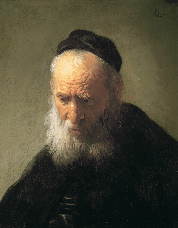
Rembrandt van Rijn, Head of an Old Man in a Cap, around 1630, oil on panel. Gift of Alfred and Isabel Bader, 2003 (46-031)

Stephen Andrews, Quick, 1992, encaustic, pigment and ink on canvas. Gift of Herbert O. Bunt, 1996 (39-052)
Rembrandt van Rijn, Head of an Old Man in a Cap, around 1630, oil on panel. Gift of Alfred and Isabel Bader, 2003 (46-031)
Illuminated directly from above, an elderly man with a furrowed brow and downy beard inclines his head thoughtfully. His dark eyes are open, suggesting an active inner life. This tronie exemplifies the distinctive character studies that Rembrandt and Jan Lievensz. pioneered together in Leiden in the late 1620s. Divested of narrative attributes that would link them to specific tales from mythology or the Bible, such tronies became important vehicles for the exploration of light, emotion, costume, and the particularities of the human face in the early 17th century. Here, Rembrandt’s soberly clad, aged figure is bathed in a spiritual light, personifying the piety and sagacity accumulated over the course of a lifetime. The manner in which the artist applied paint to the panel characterizes his early style: thick, unblended strokes articulate the wrinkles of the forehead and the folds of the nose, while scratches made into the paint with the butt-end of the paintbrush convey the individual hairs that make up the eyebrows. The monogram at the upper right “RHL” for “Rembrandt Harmenszoon Leidensis” signals the artist’s assessment of the painting as a completed work of art.